We have spent over a year working on getting you something New and Improved! We hope you love it as much as we do.
This is not a totally live set yet but we are asking you, our community, to go in there and check it out.
Find the bugs.
Find the misspellings.
Find the broken links.
Pictures that aren’t working.
Anything that is not working correctly.
Create an account.
Click through and go to the knowledge base.
Submit a ticket. (Please write “new website test - ::your subject::” in the subject so we know they came from the new site.)
We have scoured the site to the best we can but its inevitable I forgot to fix something. Please let us know below what you find below in this thread. We are planning on getting this live next week so I’ll leave this up all weekend and fix what you guys find as fast as I can.
We still have to test making an actual purchase. We don’t know what that does yet so use caution there.
Special shout out to the entire Inovelli team for all their hard work!
Thanks again for all your help with this. You guys are always great and we appreciate you doing this!
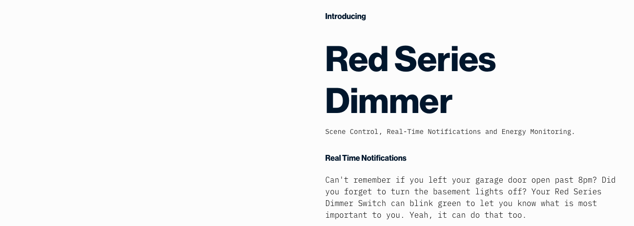
Front page Red Series Dimmer – “Designed with You in Mind” displays properly, everything after that doesn’t have an image associated with it. Shows “Buy Now” for Red Switch.
EDIT this might be better characterized as the red switch is using the red dimmer image.
Not sure if this is possible, but when you’re in the products tree, it would be nice if the drop-down menu would be at the products level instead of the top level.
Curious on how many ppl feel this way. We were a split camp on this one so we compromised with a search bar.
On one hand, the top level keeps it cleaner, whereas adding in the products makes it easier to drill down to the product level and find each SKU individually.
I won’t spill the beans as to which camp I’m in lol
1- Registration : The state/province combo box always display US states. I’m from Canada, and can’t choose my province.
2- Shipping : Unable to checkout (probably normal), so can’t check if you can select a Canadian address, but for the shipping estimate, unable to select Canada for the country.
One of the confusing things about Inovelli when I first looked at your devices was comparing the models. So it’s nice that you have a “compare” feature. However…
Currently the devices that dont have matching features, also don’t have matching visual lists. What I mean is that if the Black Series has 4 features and the Red Series has 6, you just see two mis-matched lists side-by-side. (and they arent even in the same order)
Recommend that in your database you have EVERY feature for every devices, and when comparing, show them all in the same order with CheckMarks for “has this feature” and blank-space (or a “-”) for “does not have this feature”.
Btw, even something as simple as “Dimming Capability” should be in the compare list. That would a PRIMARY feature you should show when comparing 2 devices. (yes i know it’s in the product name, but should be on the list too)
I remember buying Exacto blades once, I purchased 1 box of 100 blades and ended up getting 1 carton containing 100 boxes of 100 blades. Thankfully they only charged me for the 1 box and my coworkers and I didn’t have to buy blades for the 11 years I worked there… LOL!
I did, however, get a thank you for creating an Inovelli account email. I did verify that the links in the email do appear to be working correctly. I sent an email reply to that email to see if that works. I received a VERY propmt response from Eric H. So this appears to work as well…
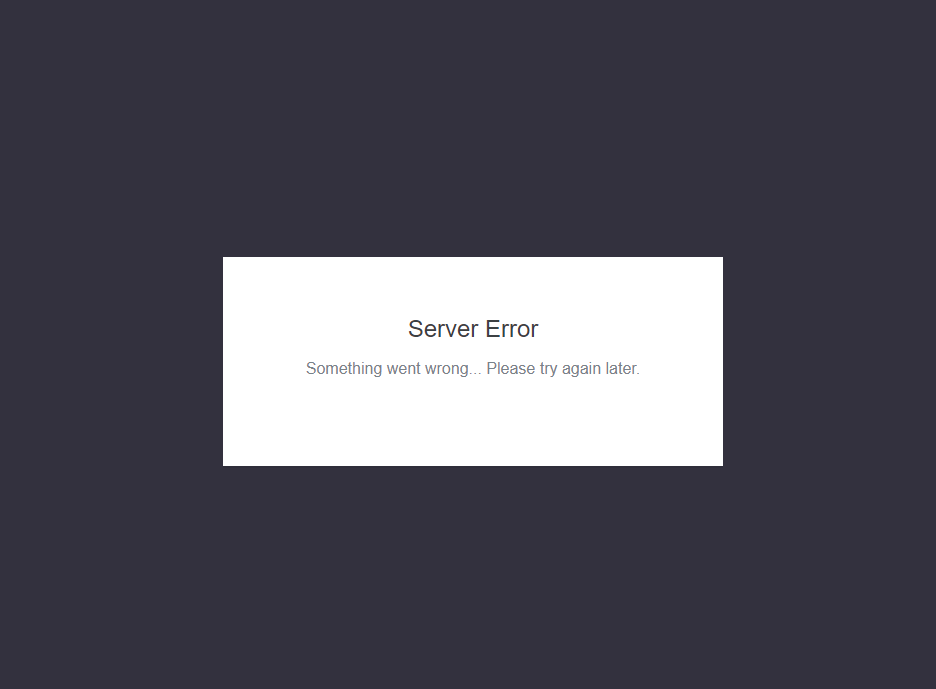
Since the emails indicated the account creation was successful, I tried to log in and received the same “Server Error” message as above. I waited a while (5 minutes or so), tried again and was successful. So I’m not sure if this error message is due to a slow server (is this a production site or sandbox?) or if it’s a bug.
Not a huge deal, but I can’t help but notice that Inovelli routinely capitalizes the entirety of “HUB” (and “HUBs”) as if it were an acronym, which it is not. Unless you are following a style guide that recommends this, the standard spelling is usually just “hub,” which I personally think looks a little better, too. This is prevalent in both the old and new sites as well as printed and electronic documentation.
On a desktop computer, I also find everything quite large, spaced out, and hard to scroll through, but I guess that’s just a trend most sites are doing now in the interest of being “responsive” and making the desktop rather than the phone side suffer. I seem to be the only one who feels this way, judging by other sites.
On the Products-Switches page, Maybe a little of my CDO kicking in, You may want to rename the fan switch to something like “Red Series Fan + Light Switch (Z-Wave)” so that its more consistent with the other switches on the page. Also, Just like the other switches you may want to list “Neutral Required” & “+ Scenes & Notifications” . Lastly check the price of this item:
Edit: I don’t know how long you plan to carry the unboxed , Red Series Dimmers, (I hope forever ), but you may want to add this item to the appropriate pages as well.
When I select “Support” from the hamburger, at the upper left hand corner of the main page it takes me to: https://support.inovelli.com/portal/home. Is this correct link? This is the existing site and I know that one works
Congratulations on the new site and more secure platform! The effort put into the site thus far definitely shows. It’s also great to see interest in having the site pre-broken before releasing it
That being said some thoughts based on a quick pass:
Navigation Bar: It could just be me, but it looks like your logo / hamburger menu are reversed. Additionally, I don’t see the point in collapsing the menu when you’ve got >1200px of screen real estate at your disposal.
Menu: I just turned on the bathroom light at 100% at 3AM in the morning… (not really, but that’s what it feels like). I’m likely a bit old school here, but I would rather see a smaller menu that’s been expanded based on screen real estate. I’m giving you 24" of monitor, why are you making me click 50 time just to see switches as a menu option?
Products: Going back to the screen real estate again… How about splitting out Switches and Dimmers? You’ve still got 80% of my screen unused so why not use more of it so I can click less?
Account Creation: The workflow leaves a lot to be desired here. Other than that 3am bathroom light at 100% brightness feel again. The field order seems rather strange, and crammed together to fit instead of leveraging the space better.
I’d love to see the fields reduced in size slightly so you could break them out some, perhaps something like this:
Email
Password | Confirm
Empty Line
First | Last Name
Company | Phone
Address 1 | Address 2
City | State
Zip | Country
I’d also love to see the site pickup some intelligence on the address entry part. There is another popular zwave store that attempts to auto-complete your entire address based on the first address field only. Yes, I am being a little lazy not wanting to type out the rest (I’m testing Edge / Chromium - so no auto fill data saved yet, but still…)
Dark Mode: It’s 2020 can we get a little dark mode love going on here? Don’t get me wrong, I love the red series dimmer working as an on/off switch (Um… Someone forgot the dimming capabilities on that unit’s firmware), but can we start with the lights out perhaps?
Passwords: I’m glad to see the site allowed my 24 character password!!! That being said showing the requirements would be nice for others. I’d also love to see multi-factor as an option, because this is 2020 and security should be a priority. I’ll refrain from requesting U2F/FIDO2 support, granted those would be awesome!


 This is prevalent in both the old and new sites as well as printed and electronic documentation.
