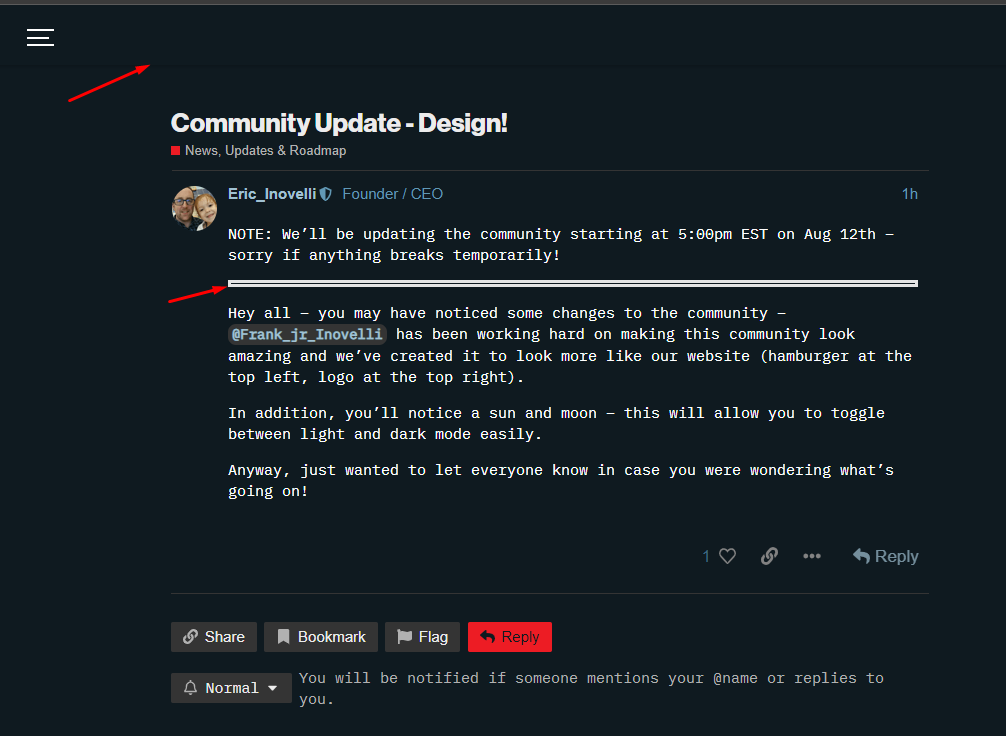
NOTE: We’ll be updating the community starting at 5:00pm EST on Aug 12th – sorry if anything breaks temporarily!
Hey all – you may have noticed some changes to the community – @Frank_jr_Inovelli has been working hard on making this community look amazing and we’ve created it to look more like our website (hamburger at the top left, logo at the top right).
In addition, you’ll notice a sun and moon – this will allow you to toggle between light and dark mode easily.
Anyway, just wanted to let everyone know in case you were wondering what’s going on!
The transition between the menu and body gets totally lost, and it looks like a few more styling tweaks are needed.
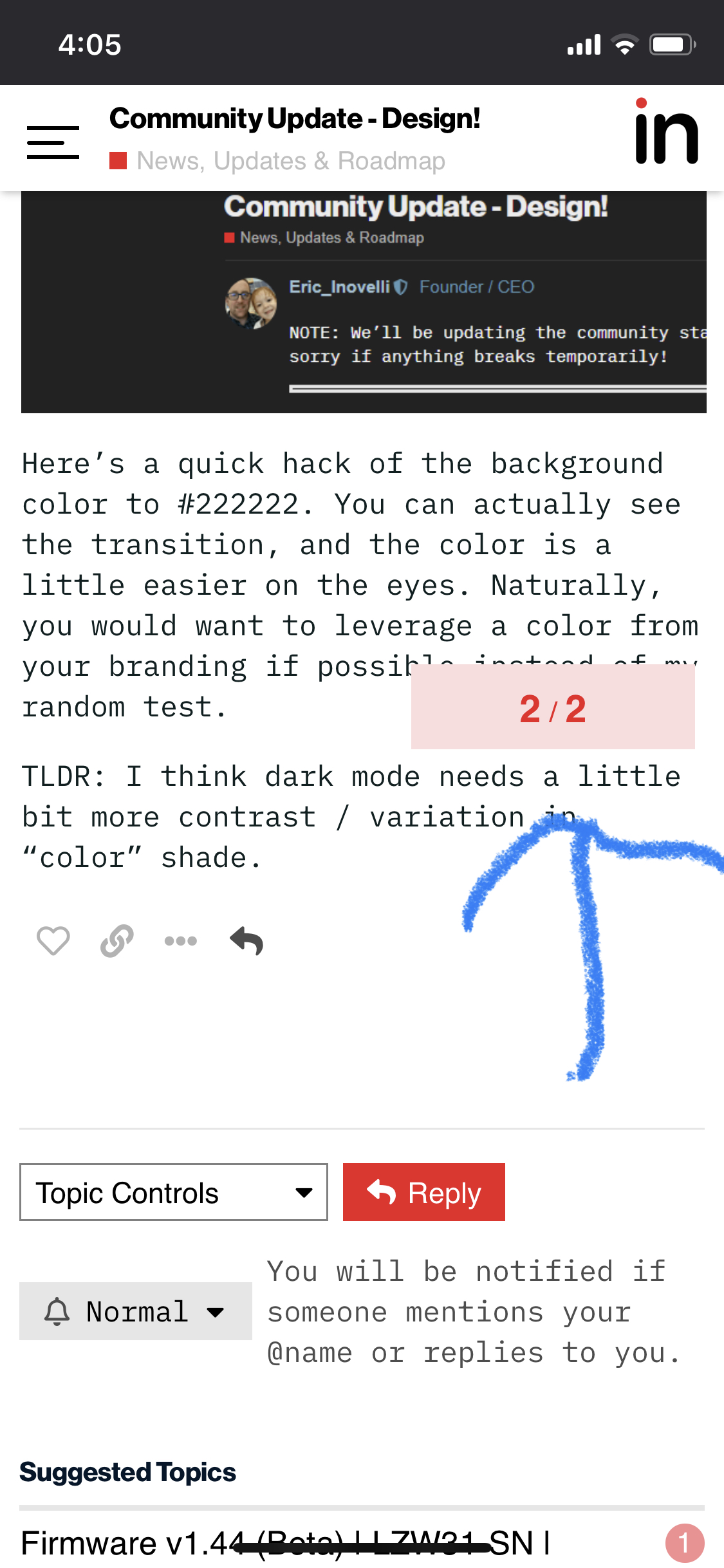
Here’s a quick hack of the background color to #222222. You can actually see the transition, and the color is a little easier on the eyes. Naturally, you would want to leverage a color from your branding if possible instead of my random test.
TLDR: I think dark mode needs a little bit more contrast / variation in “color” shade.
I was dreading the contents of this post after I read the headline, only to realize I was already using the new design (this was the first post I read) and didn’t even notice it yet. Nicely done! (Thanks for not doing a SmartThings and messing up the Community forum for no good reason.) I not only don’t use dark modes but actively dislike them, so I’ll leave it to others to comment on that now that it’s easier to get to.
Ran into another issue trying to cancel an edit to a post in firefox. The dialog box was not visible. It worked in Edge. Same problem when trying to upload an image.
We can look into the grey possibly when we are able to update the main site.
I did notice this part has changed and I’m not sure why – @Frank_jr_Inovelli, is this something that can revert back (problem is I don’t remember what it used to look like – I think it was just a solid line that was maybe 1-2px)
@Frank_jr_Inovelli – Last thing I noticed was that the sun/moon disappears when you click on a topic.
But man, I’m in love with the new layout – so much easier and streamlined than before. Little did I know there was 30k lines of code to sort through and these, “little” changes made to the navbar actually required Frank to break Discourses code and re-hack it to make it work. Amazing.
Forgot what that bar used to look like, but now I fixed the collision and it is back to the old style. In regards to the icons disappearing, they show up at the top but disappear to ensure that there is room for the extra info wrapper, but on desktop there still should be room. I’ll definitely look into that.
Glad you’re happy with it. When I first made the theme selector live I clicked back and forth for a while because I love the new way to switch themes.
Update: resolved. Theme toggle icons remain visible while scrolling on desktop.
Can you make the category images smaller and/or side by side on mobile devices? I generally read on my Android, but when I go to see the latest, I have to scroll a long way just to get past the list of categories before seeing any content.


 both issues fixed.