To answer your original question, my wife (who is a shoe designer) and like the Red, it seems more “soothing”. The blue stands out more but has an off putting characteristic.
Well, Red and blue specifically have a particular impulse associated with them in the brain. Red is impulsive and action, blue is thoughtful and patience.
Here is a fun video talking about it in detail

1 Like
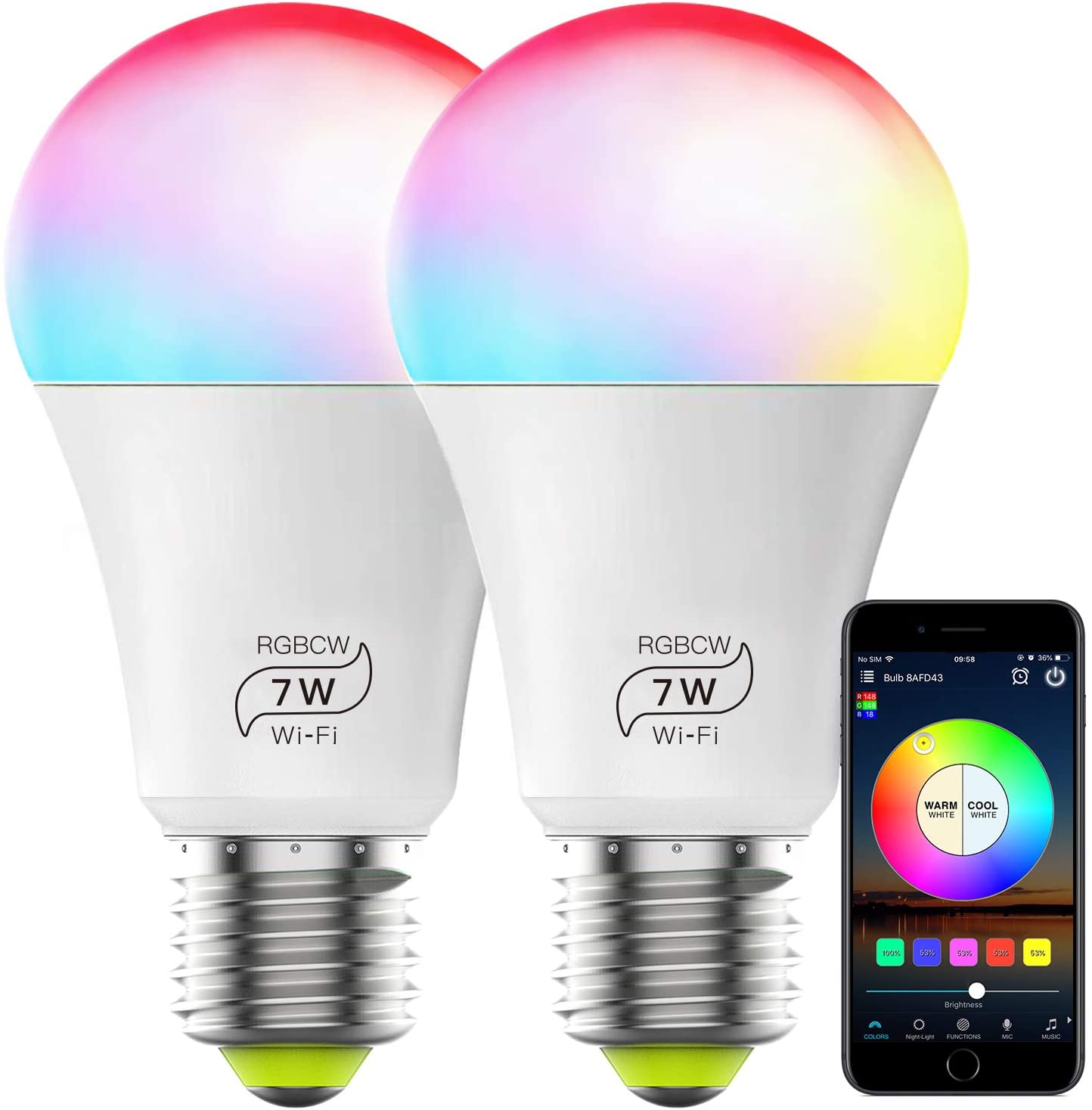
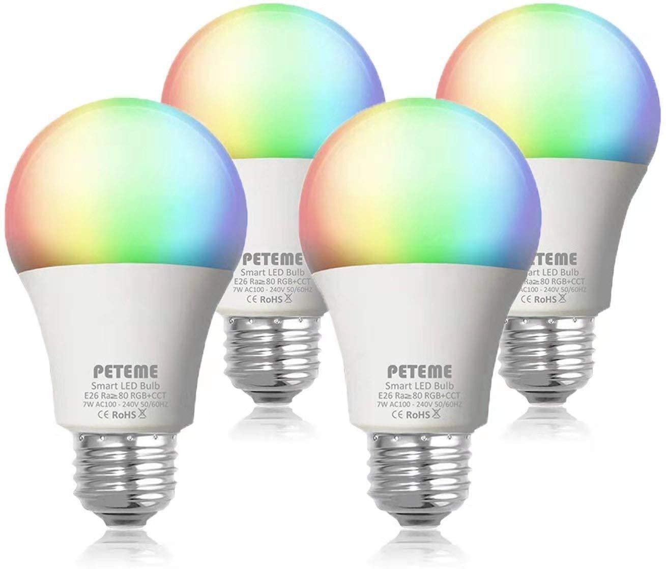
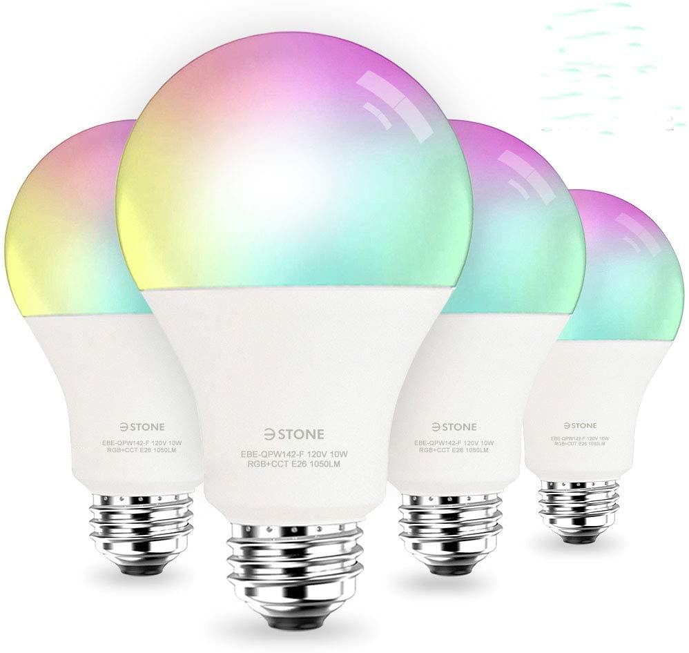
How about an airbrush fade from red=>green=>blue to show that it is an RGB bulb? Lord knows half of the RGB bulbs on Amazon are already doing it!
3 Likes
I’ve seen a lot of feedback that I would echo (powered by, value props on front, red/black), so I’ll try to only mention the unique bits.
“Smart X Switch” / “Smart X Bulb” feels kind of like generic cereal to me. Even model numbers would help these not feel like white-label products-- not saying they need fancy names (though I like Ilumin), but this is a premium product at a premium price. The photos look great and are very on-brand for you guys, and then the right half is just a bit meh.
I loved the motif on the holiday packs and you have vestiges of it on the strip/bulb. IMO that’s a way nicer visual than the very stark red against the clashing switch indicator colors on the Red Series boxes. I would almost make the Black/Red series a distinct badge or ribbon, and use that to indicate what makes Black different than Red by sneaking in some value props. (I just realized that you have “Red Series / Black Series” in shiny print in the same color. Gimmie some contrast!)
I know people won’t necessarily understand Z-Wave vs Wi-Fi vs Zigbee, but I really think that needs to be on the front. Especially if you launch Zigbee switches I want to differentiate them quickly.
I think “works with” or other logos can live on the back. I’m used to that on Google or Apple packaging. Inovelli on the front, Z-Wave on the front, rest to the back.
Love the idea of the cereal box side with the Amazon-style comparators. Make sure that you clearly highlight which column is in the box that I’m holding instead of making me match a name or model to the front of the box.
1 Like
Actually I misread what the cereal-box badges you were talking about were. I meant something more like this on the side:
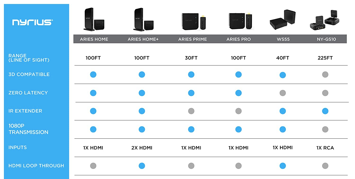
Show me the differences between Red and Black and between Fan/Light and Dimmer.
I second this part.
Those logos will help share a ton, they dont have to be huge.
I Second this
If thier going into the store with research, then it doesnt matter if you have pretty packaging or white carboard and sharpie, If thier going into the retail to make a decision then you need to get thier attention, and make you think your amazing! So I would plan for the shelf shopper as opposed to the planner for the retail style, and the researcher for the online style.
This looks WAAAAAAY less White label/dollar store-ee to me! But still simple and elegent
My final thoughts are to cater to the “Least knowledgable” consumer. Anyone who does research before hand wont use the package for more than confirmation, and anyone who is on the fence will most likely be looking at price vs value at the point where they are holding both in the store.
This is a good point and I agree totally. It’s also the downside of ‘super clean’ packaging design- nothing to identify or differentiate your product other than the design. That only works when people already know your product IE Apple products. In Inovelli’s case, it’s important to attract a consumer and create an emotional reaction (modern, sleek, sexy, high-tech, etc) but also inform them of what’s inside and why they should buy it.
I think you answered your own question there about why we wouldn’t do it this way…
1 Like
Fair, but perhaps they all do it that way because it’s an easy and effective way to communicate that a bulb supports RGB.
If you want to spend more on the package and do something TOTALLY unique, use a diffraction grating sticker for the bulb top so it appears as one solid color but that color changes as you move past it. That would surely turn some heads… costs more though.
3 Likes
I do like that idea and we might have to look into how much that is. The blended color bulb is an idea that we tossed around but I think ultimately there isn’t a way to make it “pop”. It always looks subtle to me. Call me crazy I guess. There are other brands that use a 1 color approach that I believe has been done successfully.
Thanks for the suggestions!
1 Like
That is quite true, especially with a striking package design like you have.
Another thought that might be less expensive- mix a bit of fluorescent material into the color ink you use to print the bulb. This is of course another print pass so that’ll add to the cost, not sure how much vs a sticker… but if some fluorescent material is mixed with the desired color ink that might give you some ‘pop’…
Dang, this discussion is amazing. I didn’t think everyone would be so engaged, it’s awesome!
I’m going to work on some mock-ups either today or over the weekend. We are meeting with our Creative Agency @OverneathCreative next week to talk further about this, but this thread gives us a lot to consider.
Ok, now for the responses (slams Monster…)
I’ll start with some discussion topics and then try my best to synthesize what’s being said and respond directly (if I miss your comments, I apologize, there’s a lot to read here lol).
@JohnRob and @zavex – I agree with the 4 different categories and I think what @Chris said in a prior post really resonated with me in that the packaging should a) attract a shoppers attention, b) communicate what the product is and c) show them why it’s worth buying.
If we take those three goals and apply it to the 4 categories, I think we’re in business. Combine that with what @Melerann and @Chris mentions (and I think it was the consensus of everyone else) in that we should be explaining this to the, “Least Knowledgeable” customer. Not only does it cover the bases of marketing our product to the various groups, it also, as mentioned, hopefully prevents returns by setting expectations of what this product can/cannot do.
A lot of the below has been commented on, so I’m just going to quote the first person to bring this up and respond to that to keep the post semi-short ![]()
I agree with this for sure – the reason why we opted to put this on the package was that there needs to be some sort of descriptor as to what this switch is. If we just put, “Dimmer Switch” or “Fan/Light Switch”, people may not know it’s a smart switch. In other words, cater towards the, “Least Knowledgeable” customer.
I’m definitely open to other suggestions for descriptor words.
For fun, I took a look at some other smart home brands (that are in stores) to see what they are doing:
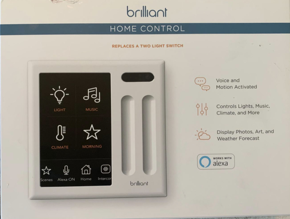
What it looks like is that the more premium looking brands (Brilliant & Hue) do not say anything about, “Smart” as it’s implied on the box with the bluetooth logo (Philips) along with the words, “App Control” under it. While Brilliant uses, “Home Control” and shows various descriptors indicating that this is a smart switch.
So, I do think there’s some merit here if we wanted to clean up the packaging by removing, “Smart” and putting something under the Z-Wave logo that indicates this is a smart switch. My only worry here is that no average customer knows what Z-Wave is whereas everyone recognizes the Bluetooth and WiFi symbols.
What does everyone think? Something to think about for sure as we move forward with Rd. 2.
Agree – we’ll find a way to incorporate this. The problem we may run into is that our Dimmers, On/Off’s and Bulbs are 500 Series, whereas our Fan/Light and Light Strip are 700 Series, so I’m wondering if this will lead to the customer saying, “what’s the difference between 500 and 700 Series”? However, all products are Z-Wave Plus, so there’s that.
Yeah, I’m leaning towards @vreihen’s idea with the wrap – I think that’s a good solve and likely less expensive than having to find a whole new box. With the wrap, we already know how much the base box costs and now we’d just have to add the wrap (which was fairly inexpensive) and the shrink-wrap – also inexpensive. The challenge with the wrap would be keeping the clean aesthetics, so we’ll have to weigh those options.
The point of the flap was to have a spot where people could learn more about the product by opening the flap and reading about it instead of cluttering the box with too much information causing overload. Under the flap would be some quick features about the product as well as some selling points and “works with” type stuff. But, I also agree, we could likely put this on the back of the box.
Our average order volume is around $115, so typically 3-4 switches. However, I can’t remember who mentioned it (apologies), but they said that they bought a switch to test it out and then once that’s said and done, they’ll buy more in batches. Most people can’t afford to outfit their entire house right away, so they’ll buy the initial switch and then maybe batches of 5 until they’ve outfitted their house. This is on par with what we’re seeing internally.
Definitely – this is what inspired our 10pks, which have been a huge hit (although no one is buying the Black Series… so we likely will discontinue that one in 10pk form).
Yeah this is a good point for sure. We’ll be keeping this in mind for Rd. 2.
Sorry, I should’ve been more clear in my description of this. It’s not only that they won’t allow the logo, they also will not let you put, “Works With” or anything related. I think a loophole could be that we say something like, “Z-Wave works with” or something along those lines. So, not explicitly saying Inovelli, “Works With” (even though it does), but using Z-Wave as they do work with these companies and these companies use Z-Wave’s logo.
Definitely ![]()
Yes, great point and I love having it show user generated content as well as our hype video. I think that’s brilliant!
Could you elaborate here? I don’t think the Monster has kicked in yet lol!
Yeah let me know – I’m curious! I typed in, “scalloped half flap packaging” and got some interesting results lol
Great point – I think that would definitely solve the issue. So simple!
This is one thing @anon14959390 and I agree on when it comes to RGBW bulb pictures (I’ve been staying out of the Red vs Blue comments bc I don’t want to tip my hat as to who’s on what side here lol)… while I understand the premise of showing this, for some reason I just don’t like it. I think bc it doesn’t look real but I’m honestly not sure. Plus, I love the splash behind the bulb on the package we currently have (as well as mocked up) and if we blended the colors, it would likely get lost.
Ok, I’ll bite lol – are you saying you want us to put, “LZW30”, “LZW31”, etc on the front of the box instead of Smart X Switch? I just want to make sure I completely understand as I didn’t think the model number was that important when making a decision, but clearly this has been brought up more than once, so I’m genuinely curious now!
Only asking bc I can’t think of a time where I purchased a product based on seeing the model number on the front of the packaging. I definitely see a case for putting it on the back to make it easier for people who fall into Group 1.
I loved the Holiday Packs for sure – in your face color! We can play around with some better contrast with the Red (I think the Black boxes look amazing, especially the LED ones with the splash in the back). The exercise we did when at a local store was to go to an aisle that sold primarily the same things (ie: bulbs, oil, etc) and find the boxes/containers that stood out immediately and most of them were red. It makes sense as it’s one of the first colors our eyes see (outside of Yellow). Having the bright red packaging should attract attention along with the bright LED bar, but maybe we add some sort of texture to the box.
I agree for sure.
Haha! We can for sure look to add this. I think it’s very helpful. The problem is real-estate. The boxes we have are pretty small, so we’ll have to get creative. This is where the flap was key to give us extra real-estate.
Well put – agree ![]()
Yes, quite the balance for sure. I think we definitely differentiate ourselves in that our products look different than the competition so that is eye-catching, but yes, I agree – they need to understand why they should buy this other than it looks cool as that can only go so far.

Love it!
1 Like
This is something most companies (95+%) do wrong and you do right- community engagement. Typical attitude is hire a social media person and that’s the end of it- try to drum up buzz but don’t actually give the community much and certainly don’t listen (or don’t make it obvious that you are). People are engaged here because YOU engage- there is no ‘thank you for the suggestion I will pass it on to the product development team’ but rather the actual product development team is here and we all bounce ideas around. Combine that with an excellent product that we get passionate about, and you get excited customers that don’t just like your product but want your company to succeed and thus spend our time helping you make a better box ![]() I just hope that you don’t lose this as you grow.
I just hope that you don’t lose this as you grow.
To go off topic for a second- that might be something to throw in the mix in the future rewards program- if this forum gets too high-traffic for you guys to follow completely, maybe make a second secret area that select posters are invited to. Call it the product focus group forum or something ![]()
Premium brands often have brand and product recognition, removing the need for descriptive packaging. Apple gives you a white box that just says iPad because everyone knows what an iPad is. Similarly, most people who would buy Hue know already what Hue is, so (like Apple) they only need to illustrate which specific product is in the box.
Brilliant doesn’t have that, but their product is such that a picture makes it obvious what the product is/does, so they can convey the ‘smart’ concept visually. Sadly I don’t think a bulb or switch can do that without a cluttered diagram. Thus, all the others say ‘Smart’.
Some do, and for them if nothing else seeing the Z-Wave logo tells them if the product will work with their system. But as mentioned earlier, it needs an explanation somewhere like ‘Z-Wave hub required’ and that should be prominent to avoid confused consumers who buy the switch and can’t use it.
I agree. I think only hardcore nerds (people on this forum) will care about the specific chip used, and those are the type that check the Internet before buying.
Separately- I’d be curious what the mix of black/red sales overall are. Personally losing scene control (or at least losing the option of it later) wasn’t worth saving $7. Especially since a value prop for me is the config button triggering some other device.
Works with (brands of certified units), then as the last item “Any other Z-Wave hub, such as: (name) (name) (name)” (no logos)? If that doesn’t pass muster, then 'Compatible with all Z-Wave hubs, including (text brand names)".
If I were to guess, it’s because without actually illuminating the thing, you have to balance between light colors / closer to white (and show a lot of white so people know it CAN do white), and vibrant colors / closer to pigment which look darker on a store shelf if not brightly lit. The result usually ends up looking like washed out pastels.
Speaking for me- I think the model number should be written either on the front in small text or on the side semi-prominently. It should NOT replace Smart X Switch. It’s largely there to show that there IS a model number.
1 Like
Eric, The part number or / model number doesn’t need to be on premium space (i.e. the front). But it should be somewhere on the box / package. And the same place for all the devices. Also you might want to be sure you are consistent with LZW31, LZW31S, LZW31-Scene, Red LZW31 and LZW31 Red, LZW31 Black etc.
I’m sure you’ve read some posts where the poster is not clear what is which.
You might also mention the alternative colors that are available.
My only worry here is that no average customer knows what Z-Wave is whereas everyone recognizes the Bluetooth and WiFi symbols.
You might be right, however I think a symbol there is better than none. And because the symbol is NOT WiFi they may better understand what it is or is not.
BR
John
2 Likes
Basically once you open the flap and see the switch, instead of just a “dead” LED bar, I’d want some sort of clear sticker (removed once the switch is out of the box) showing an example notification state (red chase or similar). This would basically show how/where the notifications happen and that could also set the red series apart from the black series.
Just a thought since that is a unique feature that sets your switches apart from almost every other brand. It’s really important to ensure you show how your product is set apart from other offerings sitting a foot away on the shelf.
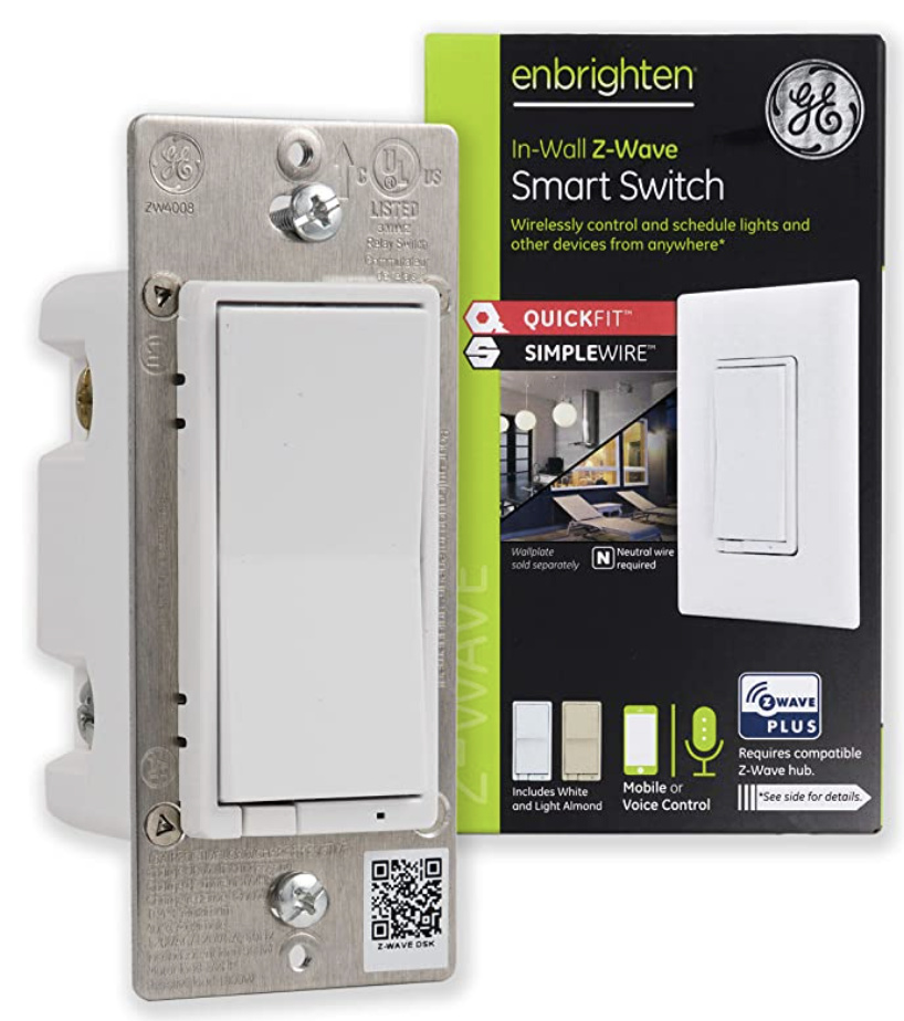
If I’m going to Microcenter and I know that I want an LZW31-SN, I’m sure as heck going to search the box to ensure I get that model number, Too many times I end up home with the wrong product. For example, look at GE, they have their model numbers clearly displayed at the top-left of the box for EASY grabbing in-store.
I completely agree, the value proposition of blacks never appealed to me.
Ok, that makes sense – I understand now, thanks for clarifying! We’ll add it for sure.
Yeah, we’ll add this too – I think it’s important!
Ok, makes sense - yeah we can see what we can do here. I think you’re right in the differentiator for sure.
Please go to the Columbus one shortly ![]() – that’s what this exercise is for actually!
– that’s what this exercise is for actually!
Sorry, I missed this comment @Chris – so the value prop here is more for targeting simple systems (ie: Wink, Ring, Alarm.com, etc) – by simple I mean systems that do not have all the bells and whistles with editing parameters, etc. The Black Series is a lower priced, more basic product.
The mixture of sales are about 65/35 Red vs Black, with Red Dimmers being our best seller and really skewing the ratio. It’s about 50/50 On/Off Black vs Red. The Black Series Dimmer really does not carry its weight, which is strange because our Gen 1, it was our #1 best seller, but I think it was primarily because of the great price point and that we didn’t do a great job promoting all the features of the scene version.
Ahh that makes sense. I think of a HA system like the sort people here have, it’s easy to forget that many people are running much more simplistic stuff like alarm system automation. And for them the extra features are wasted.
That’s really interesting, I wasn’t expecting an answer there so thank you for that ![]() I suspect the Black on/off are more popular because the places you would put an on/off are usually places like outdoor floodlights, garage light, basement light, etc; the places where you don’t need dimming are also the places you don’t really need scene control or LED notifications.
I suspect the Black on/off are more popular because the places you would put an on/off are usually places like outdoor floodlights, garage light, basement light, etc; the places where you don’t need dimming are also the places you don’t really need scene control or LED notifications.