Hey all! Wanted to let you know that we’ll be updating our packaging shortly and wanted to show it off a bit. We’re still in the design process so we’d love to hear your feedback.
What kicked this off is that we’re about to be in a test in retail (not disclosing yet) so we need to update our packaging. Currently our packaging is designed for online (you can do most of your research on Amazon or our website, so we don’t need to clutter our packaging with information) but we need to update it to cater towards retail.
That said, we will have two versions:
Online
Retail
We want our packaging to be similar across channels. Here’s what we’ve come up with from a concept standpoint.
Retail:
Will have a flap on the front that you can open that will open up and you can read more about the product
Online:
Will not have this flap
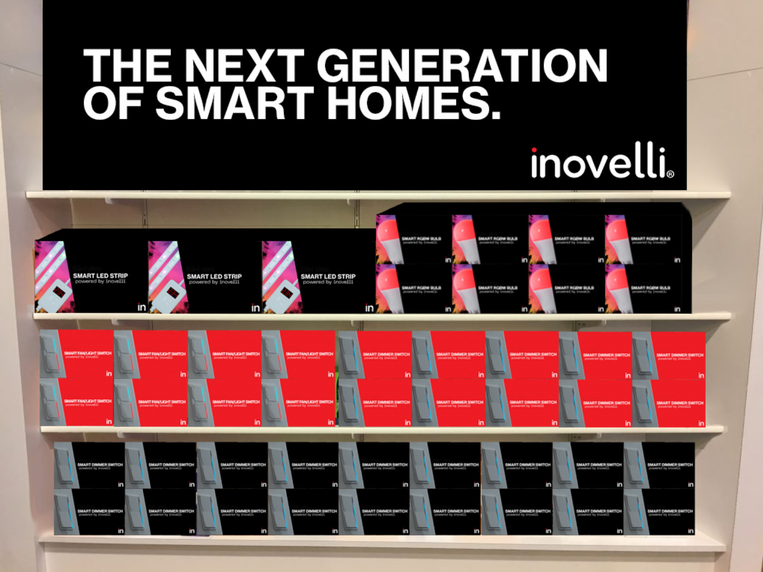
Here are the concept for the top of the package – we’re still working on the sides and under the flap. More to come here based on feedback.
NOTE: I didn’t mock up On/Off switches, but they will look the same as the above.
Feedback Requested:
How this will work is that the red or black part of the package will open for retail packaging. What we’d like to know is what are the most important things when shopping for a smart switch, bulb, etc?
To us, what we’ve found is that people want it to be simple. No need to explain everything under the sun… KISS (Keep-It-Simple-Stupid). The average customer does not know what Z-Wave is nor what any of the protocols are, so no need to bore them with that. They want to know they can control their switches remotely.
So, what we’re thinking is the following:
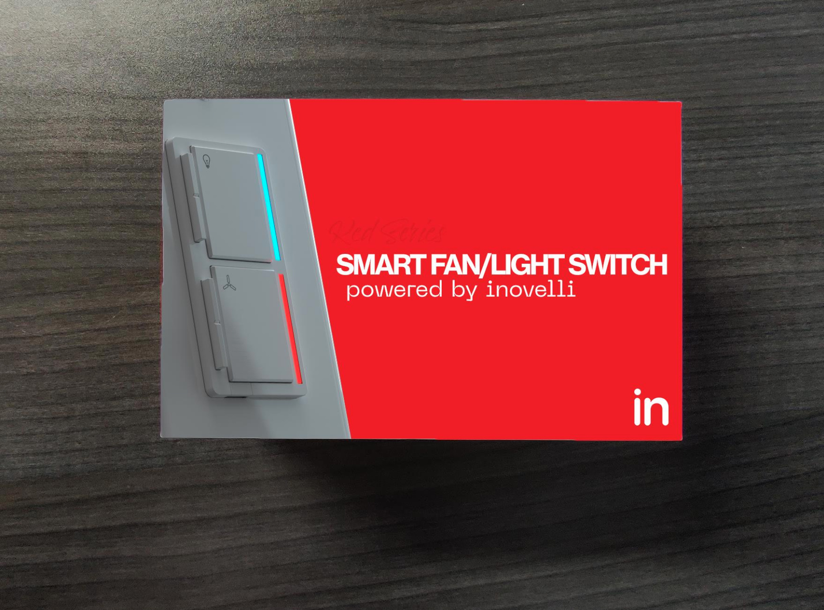
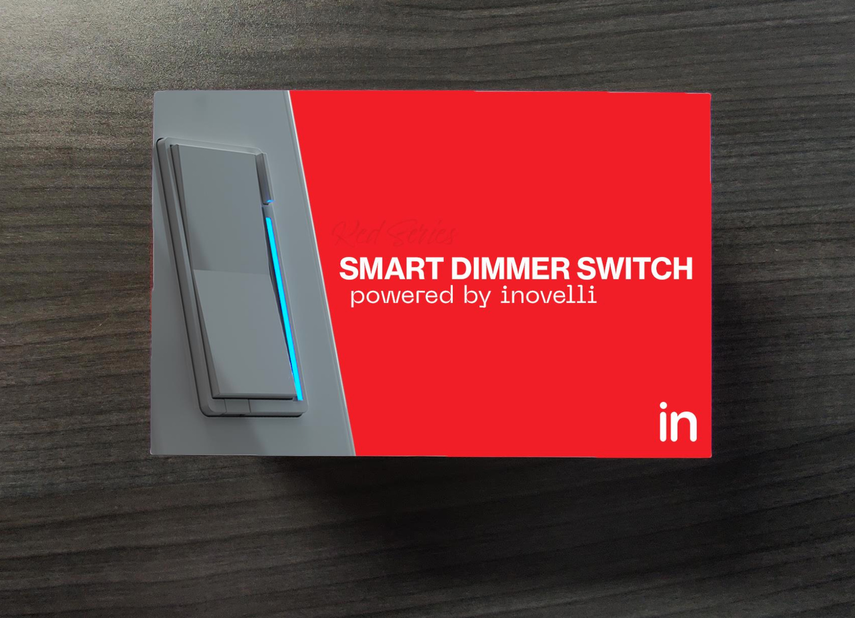
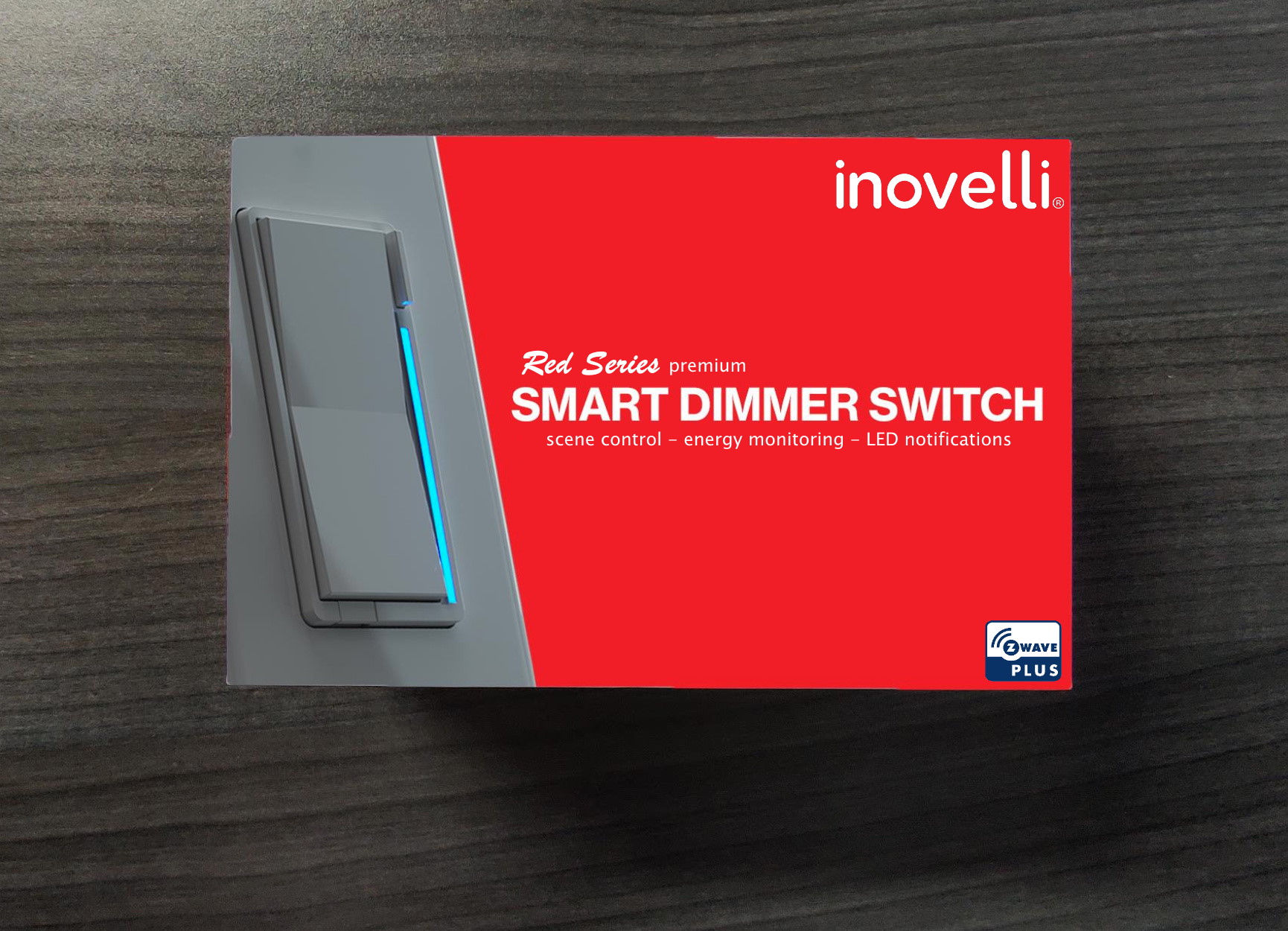
Red Series Switches
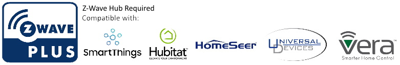
Hub Required (list compatible Hubs)
Easy Wiring Solutions (link to easy wiring schematics and/or videos)
Control from Anywhere
Notifications (RGB Notifications)
Scene Control
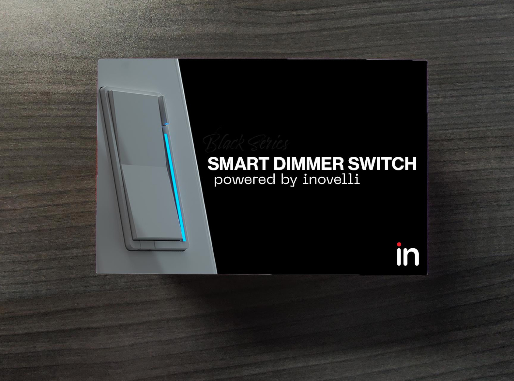
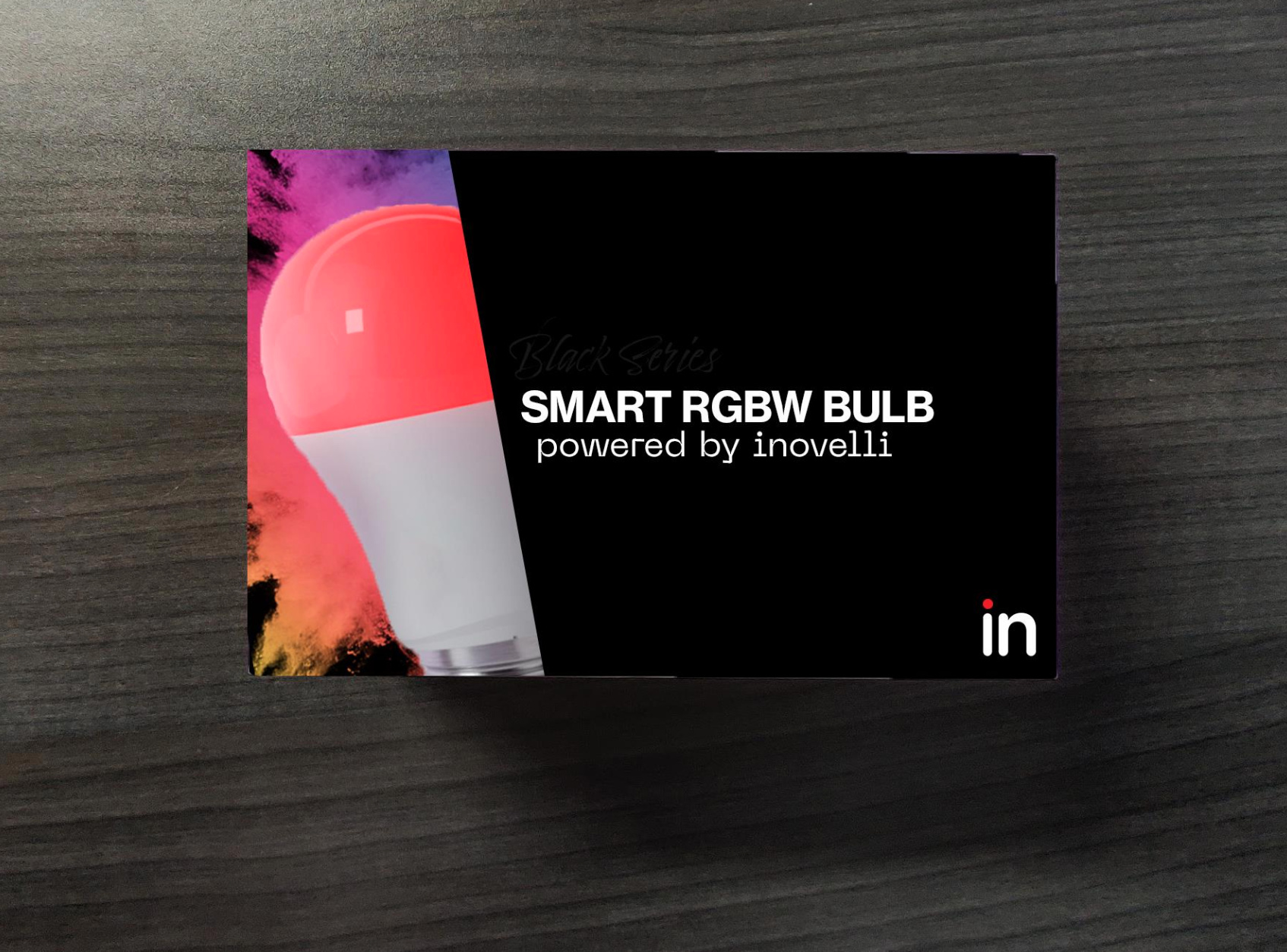
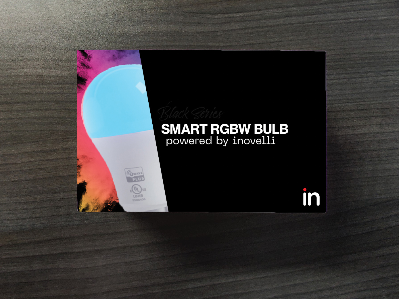
Black Series Switches
Hub Required (list compatible Hubs)
Easy Wiring Solutions (link to easy wiring schematics and/or videos)
Control from Anywhere
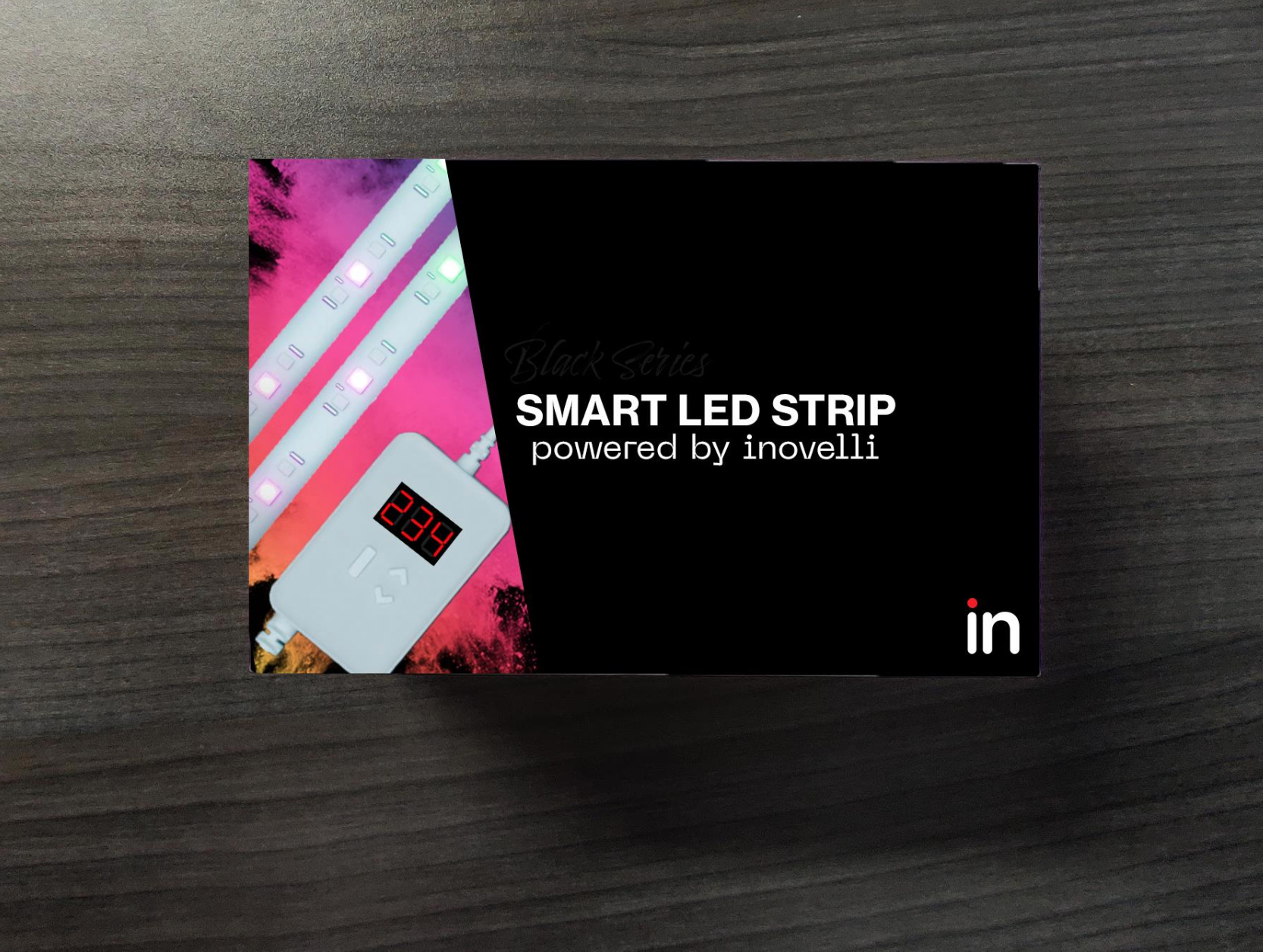
Black Series Bulbs/Strips
Hub Required (list compatible Hubs)
Control from Anywhere
Create Scenes/Color Options
Any other thoughts?
EDIT: Shoot also, there’s an internal feud going on between which one looks better so we’re curious what your opinion is on this design.
Let me start with a Congratulations on the retail test!
I conducted an impromptu survey (better half + me) and we both came to the same conclusions on the packaging. The first impression when mentioning there would be two different package designs for the same product (retail vs online) was confusion. Well, it was more “did I purchase the wrong item” or “what’s different about the product”. It makes sense from a use up the existing packaging perspective, but beyond that it introduces unnecessary confusion.
In regards to the actual packaging the flap got mixed reviews. It’s a good way to maintain the clean aesthetic of the box, however it needs to be very clear there is a flap to open. Personally, I can’t think of a single product I have opened a flap to read about in the store. In short that information would likely be non-existent to me.
My personal suggestion would be to put that information on the back of the box, as that’s the first spot I look to read about any product.
One thing that isn’t well communicated currently is black vs red. This goes back to the first point - I see two dimmer boxes and the color is different. What’s different about these products? Assuming every display will have some banner per your final mockup - this would be a great spot to highlight the differences.
When I first started looking at these switches, this information was harder to find than I expected. What about putting a table (on the side, on the back) that shows a comparison of capabilities, with a “highlighted” column that indicates the specific switch in the box.
Another though, what about a QR code that links to more information - like the wiring diagrams, user stories of how they have been used? For me personally, two of the defining features of the dimmer/switches was the “smart bulb” mode, and the notification LED. Examples of using those could lead to an aha moment on how they can use the bulbs.
On the fan switch, I would think having that you can convert a single dumb switch into two separately controllable switches would be important - my first though on seeing those boxes would likely be they won’t work with my fans as I only have a single switch.
I dont know why, but they look kinda Dollarstore like to me. It might be because everyone else’s boxes are covered in info, but I would suggest a little more on the front, like a QR code or slogan. QR code might get them at least on the site, even if they don’t buy.
I have separate fan switches all over my house–except one.
After digging through the details on the website I realized that I could likely use the Inovelli switch “as is”. So, that’s a tempting upgrade (as it will allow me to dim the lights on that combo fan/light now)!
(However, for the others which have a dedicated switch, I’d far prefer a direct fan control–a la the Jasco one).
In any case, your point is great–because the ability to swap out a single switch with this and control the lights and fan separately is a huge deal. That would seem to be a key niche for their fan controller.
I think the problem here will be the average consumer may think it’s something that will just work out of the box with Alexa or Google and then they will get it home and be upset and end up returning it. I think some mention of requirements needs to be there.
I had this thought too, although, he did say it would mention ‘hub required”. I think that even though average customers won’t care, some are going to scrutinize the box for the protocol… even it’s in the fine print and requires a magnifying glass to read.
those look really cool! Some notes in no particular order–
‘Powered by Inovelli’… I don’t love that. ‘Powered by’ usually means the product has 3rd party technology that ‘powers’ it, IE ‘Dell laptop powered by Intel’. Here it would be ‘Powered by Z-Wave’.
I think you should write out the whole brand name (stylized) in one of the corner. Make that consistent across all the boxes, part of the brand image.
I like the clean aesthetic, but clean should be in service to clear messaging and attracting a customer, not a goal of itself. In retail you want to a. attract a shopper’s attention, b. communicate what the product is, and c. show them why it’s worth buying. You’ve got A down, and some of B, but none of C.
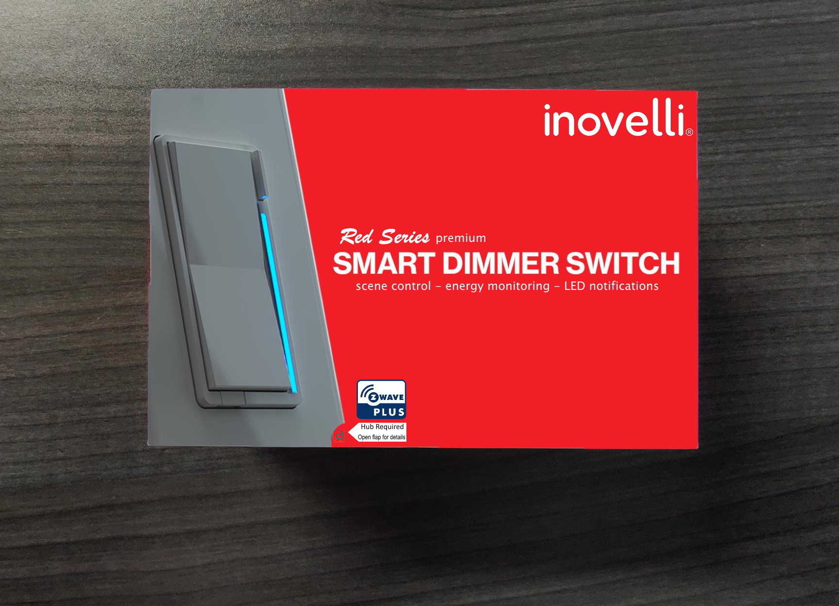
I like the prominent description- SMART DIMMER SWITCH, SMERT RGBW BULB, etc. But the design does nothing to communicate the difference between black and red, or that it needs Z-Wave.
For the red box, the stylized Red Series is almost impossible to see against the red background.
I suggest put above the product title ‘Red series- premium’ and below the title ‘scene control - energy monitoring - LED notifications’. That way at a quick glance a consumer can see that the red switch is better and why.
I also suggest put just the Z-Wave logo in one of the corners. That will be especially important as you start making ZigBee products, to differentiate one from the other.
Anyway here’s a quick mockup of what I have in mind (sorry I don’t have the right fonts, but you get the idea hopefully)-
Putting on my bean-counter hat in New York, let me make a few suggestions about the packaging.
When you move to retail, shoplifters looooooove packaging with no tamper seals or simple tamper labels that can be peeled back and re-stuck. They will pop the box open, take the contents, and leave a future purchaser holding an empty box with screwdriver in hand to do their install. Obviously not a huge problem that you’ve had to deal with in mail/Amazon fulfillment, but a problem with retail.
Having to make two separate packages is more expensive, and leads to products that can only be sold online and not shifted to retail to cover demand. I’m also not sure how the flaps will fare in terms of durability.
My suggestion is to use the existing packaging for its “perceived value” (think Apple un-box), but put a printed cardboard sleeve and shrink wrap seal over the whole thing. For illustration purposes:
Wrap the sleeve around the entire length of the box (as many other products already do), and shrink wrap it.
I will leave you do the math about whether the savings from only having one SKU/packaging for both online and retail offsets the “throwaway” cost of the retail sleeve/wrap and a couple ounces of additional shipping weight for online packages. I’m thinking that it will, especially in small production runs.
I’m not going to be popular among the regulars here for writing this part, but open-box products are not a profit center. Package for the worst (retail), and have all of the bases covered…
@Chris said my thoughts better and faster than I could.
I would just add that as a consumer, I would really appreciate a comparison chart between red/black series in the flap. Something like this, but you only need to show the current product.
Edit: I think you should specify in the flap what is included in the box: switch, faceplate, wire, etc.
Basically every smarthome product is tagging not just the hubs but the assistant they work with as well, even if it’s through the hubs. If you can figure out how to include the Works with Alexa and Works with Google Assistant program logos that’s a win. Similar story for IFTTT. Basically I want a backflap littered with the logos for the stuff I want to integrate with.
And I think a lot of people will also want to see the 700 series zwave+ logo where possible.
For bulbs I want to see brightness, color range, color temp range. For switches at least one clear shot showing all the wiring connection points on the device so I know it’s basically like a normal dumb switch and I can probably figure it out myself.
Awesome feedback everyone, this is exactly what we were looking for! It’s a tough balance between maintaining the sleek look without cluttering the box and also providing enough information for someone to make a decision, but I do see the merit in a lot of what is said above.
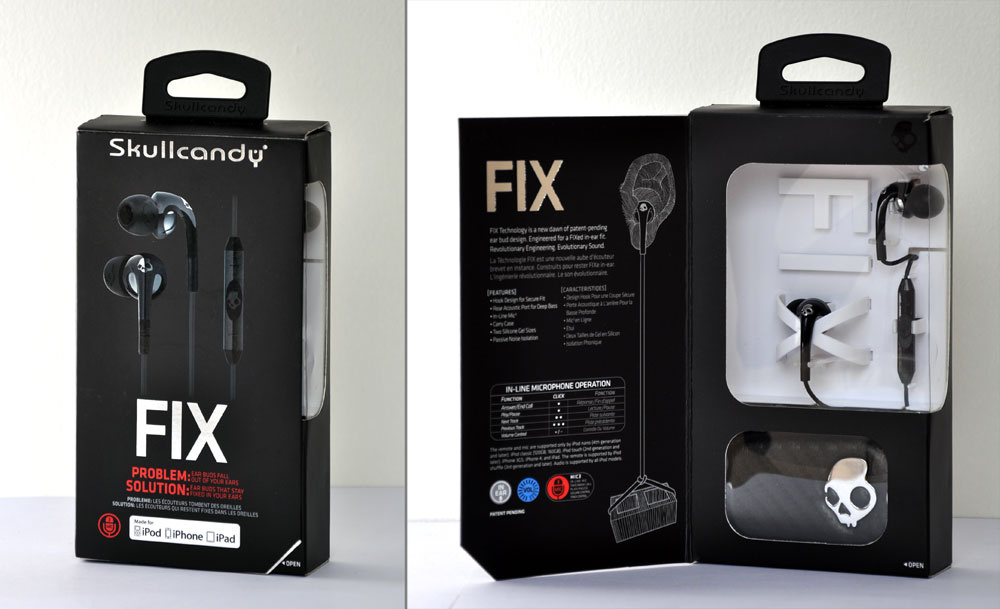
Our influence around packaging comes primarily from Apple with a mixture of Skullcandy.
Apple has the luxury of people knowing about the brand, what their laptops/computers do, etc, so they do have some creative license to tone down their retail packaging to make it look sleek. They also typically have their own section in the store that will tell the story of the products.
Skullcandy on the other hand uses flashy colors that catch your attention and beautiful 3D renderings of their products that are in your face (who knew a set of headphones could be so sexy!)
Yeah, we hadn’t thought about this scenario where it could add confusion and I’m on the fence myself as to whether or not it’s something we can take the risk on. I definitely see your point as if I ordered one on Amazon and then went to Home Depot or something and the packaging was different, I’d wonder if I had an older version or not.
The goal was to make it look exactly the same from the front (ie: one has a flap and one does not, but the overall “picture” was the same) to try to mitigate this, but at the same time, I can understand the confusion this may cause.
Yeah, I agree – I’ve definitely seen this before and Skullcandy is a great example of how this implemented:
But I do see the, “Open” very clearly, so I think that’s definitely something we need to do.
Yeah, this is an option too for sure.
Yeah, it’s hard to see but it says, “Black Series” and “Red Series” above the White Font – the goal of it was to be glossy (like the bulb/switch) so it would stand out better and capture your attention, but yeah I agree, we need to show somewhere what the difference is. I liked the option of having a comparison chart somewhere on the box that was mentioned by @gibbor and @zavex
Yeah, I agree – definitely something we need to implement on our website more clearly on the product page as well. We did do this on Amazon, but it never translated to the site.
Fantastic idea about the use cases – I think that solves a lot of the confusion around the question, “this looks cool, but what does it do?” We get this all the time from investors or explaining it to people who ask us, “what do you do?”. Usually we just say we make products that allow you to do x, y and z.
Question around the QR Code – kind of like @amdbuilder’s comment around never opening up a flap on the box, I’m similar when it comes to QR Codes. I don’t think I’ve ever used them and would feel awkward opening up my cell phone to scan something at a retail store, but I honestly could be the odd man out here, I’m really not sure!
EDIT: I think this will help the more I’m thinking of it – we could link it to a video of some sort that really sells the product and it’s abilities. I’m still curious on who all uses QR Codes though lol.
Yeah, great point!
Oof… LOL.
Yeah, it’s a struggle to balance clutter vs aesthetics. I’m looking at a GE box right now and it hurts my eyes with how much info is packed on there. This goes back to the argument of the target audience. Are they going to a Best Buy or Home Depot looking to make a decision on a smart switch, or have they already done their research online and noticed that their local store has some in stock so they go there to pick it out.
My gut tells me it’s the latter as typically our consumer is in the more advanced stage of their smart home journey (ie: they’ve surpassed the Echo’s and Google Home phase and want more in terms of automations) so they’ve done more research prior to purchase. However, I think this will need to be revisited once we go down the mass market route with CHIP.
Agree
Yeah, I definitely see the need to put some sort of blurb on the package that says that this requires a hub and this will not work directly with Alexa or Google Home. Similar to what @chris and @datavortex mentioned is likely the route we’ll take. The problem is trying to get permission from the bigger brands to use their logos. SmartThings requires you to be certified, but their process is hit or miss for the official certification. We’ve had some go through quickly, while others are I’m sure sitting at the testing station collecting dust in Eastern Europe lol.
Preach!
Yeah, the more we’re thinking through this, I think you’re right. We initially put, “By Inovelli” but that looked weird, so we changed it. I think your solution of putting selling points below it is awesome so we’ll likely go that route.
This is a good reminder, thank you. Sometimes we (me especially) get too focused around the aesthetics and attracting attention, that we can become distracted from the real goal which is to get people to buy the product. I agree 100% with your assessment here – thank you!
I see your point around the Red/Black Series being hard to read. It could be because this is a photoshop rendering, but the thought was that the box would be matte and the switch/bulb and Red/Black Series would be glossy to draw your eyes there.
As for Z-Wave vs ZigBee, yes I agree we should start doing this. As much as I am ragging on the GE box, they did kill two birds with one stone in their call-out on the front:
Love it! Especially the call-outs below.
Ah crap – I’m in the marketing department, we’re always the first to go when the bean-counters look at all that frivolous spending on pretty pictures lol
Yeah, this is a good reminder – I agree.
You’d be surprised at the products we get back in our packaging from Amazon. I think one time we got some tampons or something lol. I remember the first time we sold bulbs (gen 1’s) someone bought 20 bulbs from Amazon and then returned them all with their dumb bulbs inside. Luckily it was easy to track down and Amazon did reimburse us, but it was still annoying.
Hmmm… I didn’t think about the shifting of demand. I’ll have to look into that a bit further. From what I remember during my Kellogg days was that most of these retailers had an idea of what they would sell through over x amount of months and would order that quantity. But, being a new product, it’s obviously harder for them to forecast what they believe we’d sell, so that could lead to a problem for sure. I guess we’ll have to push them to order 16 weeks worth of inventory at a minimum as it takes 12 weeks to produce Z-Wave products.
Yeah this is interesting – I think this is a good solution. I’d have to play with the aesthetics a bit, but this could be something. Thanks for the pointer here!
Yeah that’s great advice for sure!
Agree, this will definitely make the box for sure!
Same with this – will definitely make the box
Yeah for sure – the tricky part is getting to use these logos, but that’s on us to keep hounding them. Some of the bigger guys also charge a hefty fee for this, but I definitely see the draw.
I never noticed the WW Alexa/GH logos if it’s through a hub – I’ll have to look into that bc that would be a huge win for sure if we could get those.
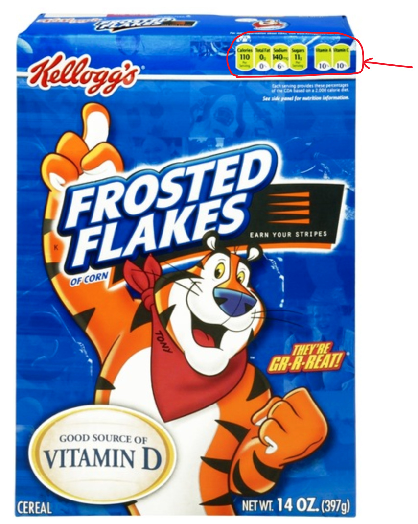
Interesting and I agree – we used to do something like this at Kellogg with cereal and cookies (I actually think it’s mandated now) where you have kind of a, “heads up nutritional info”
I started thinking about the Red bulb vs Blue bulb but once I started thinking more I see the question is much deeper than that.
While philosophically I subscribe to the KISS principle I don’t think it applies here. Perhaps if it were a “basic” item like a regular bulb or battery, but here you have a range of potential customers.
I can see a whole spectrum of customers but I’ll keep it to 3 categories.
Folks like those who responded here, We only need a Description and Part / Model number. BTW I find it frustrating that you don’t make more use of model numbers. The rest could be shrink wrap to keep it clean.
Folks who have done some research but have not chosen the brand to purchase. I believe this is likely the market where packaging and information could sway. I think clarity of use and discriminating features wins here.
I love @vreihen suggestion! Not for the same reason but to be able to see the product without taking it out of the box. And get a better look as everything is there to see.
I think the following information should be on the back:
Model number and product name
For the RED series it should say “SCENE CAPABLE” BLACK should say NOT SCENE CAPABLE (but in a more positive way??)
SMART** Device, can be controlled by compatible hubs (i.e ST, HUB HA etc)
CAN be used in installations where a neutral is NOT available.
Operation can be customized. 22 parameters are available to find tune you installation.
Easy to wire, simple straight wire connections.
whatever else can be included.
Logic. Lets say I’m in HD and looking at the Inovelli or GE Embrighten switches. I’m not familiar with either but I know the GE name. How do I decide? I use the info on the box, that’s all I have at the time.
Is the impulse buyer, flashy packaging probably make the difference. But these are the folks who will probably return the device once they figure out its too much work to get it going.
** BTW everything now a days is “Smart” the word has lost any real meaning.
So much good feedback already so I will only try to mention my key thoughts or stuff I did not see otherwise:
The red vs blue… I choose blue because it stands out better against the background image in the sample. The red looked like it blended in. The blue also had the Z-Wave Plus apparent while not requiring it elsewhere on the box.
Z-Wave Plus (possibly mentioning 700) is important. Just because it is Smart (which I also agree is so overblown to be worthless already, like blue LEDs on “tech”) there are too many competition ways for them to talk. Being clear about the main part matters.
The “key features” under the product item would be nice. Not listing scene capable would help differentiate Red/Black (which I never remember anyways). I have many scene capable devices but I know I have NEVER used a scene.
My thought is that the flap does not add value. Unless you want to have more material inside and show the product (and how “sexy” does an unpowered switch or bulb look) I do not see it adding value.
Larger quantity packages. I agree that for single units, one style of package is best for the majority of it. Maybe a sleeve for retail vs online. However how many people are buying these things individually? In the forum here I see mention of all sorts of people buying multiple switches or multiple bulbs. I cannot afford that, but many people in this market can. So it might be good to have a couple designs for larger quantities when someone wants to buy a batch of them but does not need the same instructions many times or such things.
True. Just keep in mind that while you want to expand your target audience, there are also customers you specifically DON’T want. Namely, the people without any hub, who have no interest in a hub, and who will assume it will Just Work then blow up your phone lines or worse return the product and post a bad review when it doesn’t. So you want to make the product appealing and sell it, but also manage customer expectations and make sure someone who takes it to the register knows what it requires.
That’s awesome. Flip the arrow and use it to illustrate the flap as well, then you kill 3 birds with one stone. Then as soon as you open the flap, right to the left of the arrow is the logos for the recommended hubs. I’d then cut a round chunk out of the flap and put a partially exposed logo under it, so it’s obvious to the naked eye that there’s more to be seen.
Thus you take care of 1. illustrating it’s a z-wave product, 2. telling consumer that a hub is required, and 3. illustrating that a flap can be opened. Sorry for the bad mockup but this should illustrate what I mean:
So for ones that you’re certified for put the logo. Then have a text box that says ‘Also works with:’ and below that just has the written names of companies that refuse your logo request. That list should also include at the bottom ‘any other Z-Wave hub’.
Yes I love this. First box- Zwave logo, and 500/700 series. Second box- LED DIMMING. Third box 3 Way Capable. 4th Box: No Neutral Required. then for the red series- 5th/6th/7th boxes are scene control, energy monitoring, and LED notifications. Come up with little pictographs for each box. Having more boxes on the Red further differentiates it from the black.
If you add a QR code, make sure you add a good text description to tell me why I should scan it. I’ll occasionally use a QR code, but I need a good reason. In this case, I think having a link that showcases how the product can be used would be neat. I highly recommend setting up a permanent redirect URL which will never change. All it does is redirect the user to content. That way you can change what the users see when they scan the code without changing the packaging. Perhaps link the featured video with user created videos under the rewards program?
I think an important 4th category to consider is those that would fall in to 1 or 2, but didn’t know the product existed. Seeing it in retail then gives them something new/more to research before they make a final decision. For these people you want something that will first be flashy to catch attention, provide enough info to hook them after a quick scan of the box, and then some way to point them in the direction to find more in depth information about the product.
I’ll just add that having a sticker over the LED bar inside the clear plastic behind the flap (mouth full!)showing it Red or blue or yellow chasing or something would impact me as a buyer to understand more about the notification capabilities on the red dimmer/switches.
I like that the front is clean. But i think those just walking down the aisle don’t really care about specifics, but if I was seriously looking, I’d notice that Z-Wave 7 is better than a competitors Z-Wave 5, even if i did not know the difference. Of course, in time, it can become dated (when is Zwave 9?)
You guys are referenced as Black or Red Series. I think you should continue to brand that, and your distinctions from your competitors. You’ve got 4 side panels and a back panel to do this.
I get ‘Powered by Inovelli’, but I also get that a novice might be confused. As a fan of Inovelli, I’m for keeping it…maybe make it a little less prominent or make it look more like a slogan
I like the Blue bulb better (warmer)… plus I think the contrast will pop off the shelf better
Rather than a flap on front that might not be seen, I’ve seen packages that have a scalloped half flap that has a sticky dollop of mild adhesive (or Velcro) on the front, so people see it is an informational flap. It might be cost prohibitive though. I’ve seen it alot on toys. Next time at Home Depot, I’ll try to identify a product that has what I’m talking about.
As far as confusion about an online pkg vs retail, I think it would be rare for someone to be looking at both at the same time…you can just print Online Packaging or Retail Packaging in a thin font on corner
Overall, I like the new designs. I do agree that that “Powered by” text is a bit odd since it is more “powered by” Z-Wave or the hub used or the electric company.
For Chris’s follow-up mock-ups, I like them, although having “LED” capitalized when no other letters are is a touch strange. Maybe all small caps or normal casing would make it look normal.