Hello, I just installed the canopy module in my bedroom’s fan and it works great but I noticed that it shows a LOT of options that aren’t very relevant to the product itself. Seems like every inovelli zigbee device that can connect to zigbee2mqtt uses the same configuration for the UI and I’m here to humbly ask you “could you not?” because it makes the product way harder to use than it needs to.
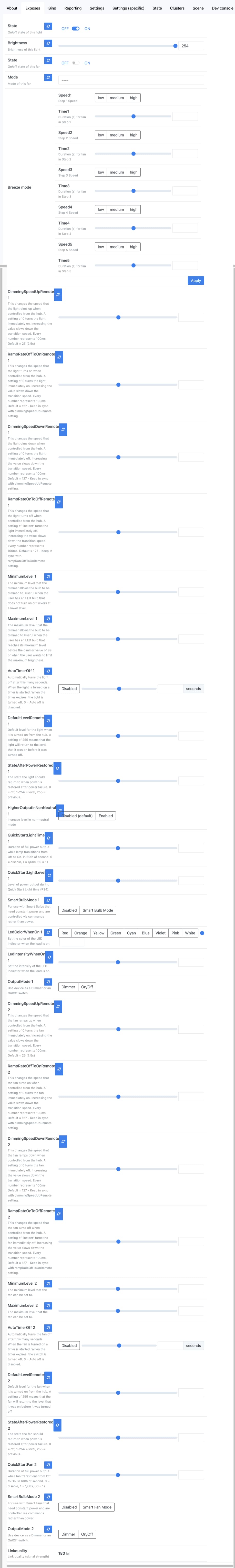
This is a screenshot from my instance of zigbee2mqtt:
Would it be possible to add device specific layouts with a more curated set of features and maybe hide some of the more advanced configurations in the “Settings” tab?
There is very little control provided over the UI when writing converters for Z2M. Z2M doesn’t allow you to control the organization of the parameters at this time. The community has already taken advantage of the options that are available for the UX of the device configuration by faking certain parameters as different types to use other displays rather than just a set of numbers and sliders. I would suggest that you raise a request in the Z2M project to enhance the organization on the exposes tab. If enhancements are made to the project than we can take advantage of those options in the converters for the Inovelli devices.
As a work around if you are using Home Assistant with Z2M you can disable entities exposed by the device that you do not need and then work with the configurration UI in Home Assistant. Other platforms that integrate with Z2M may have similar types of controls, but I’m not familiar with them.
We spent a lot of time trying to get it to group things in a more reasonable way. This was the best we could come up with.
That said, for the canopy module itself, there really are that many options available. They all do what is described. The challenge is, many of them appear duplicated as the same option may be available on both the Light and Fan endpoint.
Any option with a 1 suffix is for the light side, and anything with a 2 suffix is for the fan side. I had originally hoped to change those over to be better identifiable, but ran out of time.
3 Likes
Actually, it looks great.
Far better to have it all, then not enough.
And considering how much you have to do, it is amazing.
any chance you might pick up the improvements again in the future?