EDIT: Poll closes next Friday (August 7) at 6pm as we need to pass this onto the manufacturer.
Hey all – you may have seen the announcement earlier that we are moving to create a non-LED based aux switch (I know, boo/hiss, pitchfork) for now (reasons listed here) and we wanted to start a poll to see what everyone thought about a few different designs.
NOTE: I’m not sure if we’ll keep the air-gap or not as I don’t think it’s required as the load is connected to the smart switch, but I kept it on there to match our current switches.
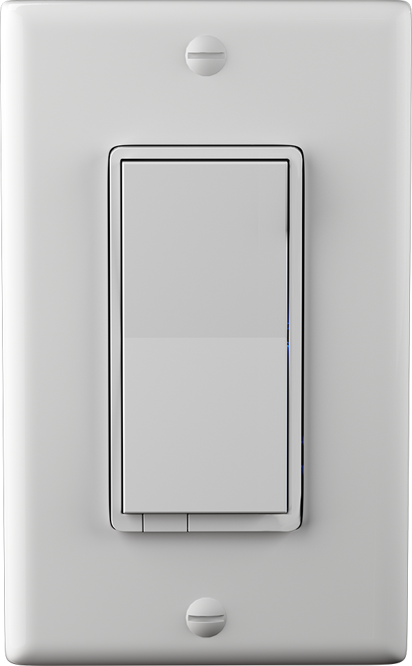
Option #1
This option removes the config button and LED bar, while widening the paddle to be consistent with the GE/HomeSeer options out there currently.
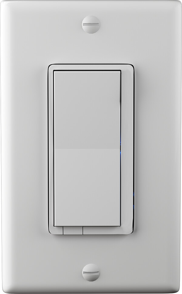
Option #2
This option removes the config button and LED bar, but maintains the same paddle width as the current Inovelli switches.
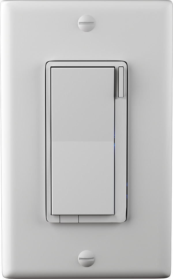
Option #3
This option keeps the config button, removes the LED bar, and maintains the same paddle width as the current Inovelli switches.
We don’t believe the config button will be able to do anything as there’s no, “smarts” built in – so please vote on this as if the config button is just there for aesthetics (to match Inovelli switches)
Option #4
Same as option #3, but pretend the config button could do something minimal like if you tap 1x, it will trigger a, “favorites” scene from the smart switch’s config button.
Voting instructions:
Only vote for 1 switch unless you vote for #4. Since we’re not sure if we can accomplish #4, we’d love to see what the backup options are.
In other words, if you prefer options #1 and #2, please just vote once. If you prefer option #4, please vote for that one + one other option.
Poll:
- Option #1
- Option #2
- Option #3 (config button cannot be used)
- Option #4 (config button can be used)


