The new site is looking fabulous! I look forward its release.
Feedback on the site as requested. Testing performed on desktop, as it looks like others are covering mobile nicely.
Menu:
The community is certainly a large part of what make Inovelli great. That said I’m not sure it deserves the prime real estate of being a top-level item. I would suggest placing it under Discover (as in discover our awesome community!)
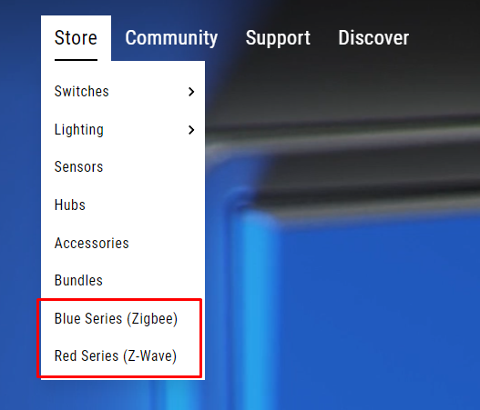
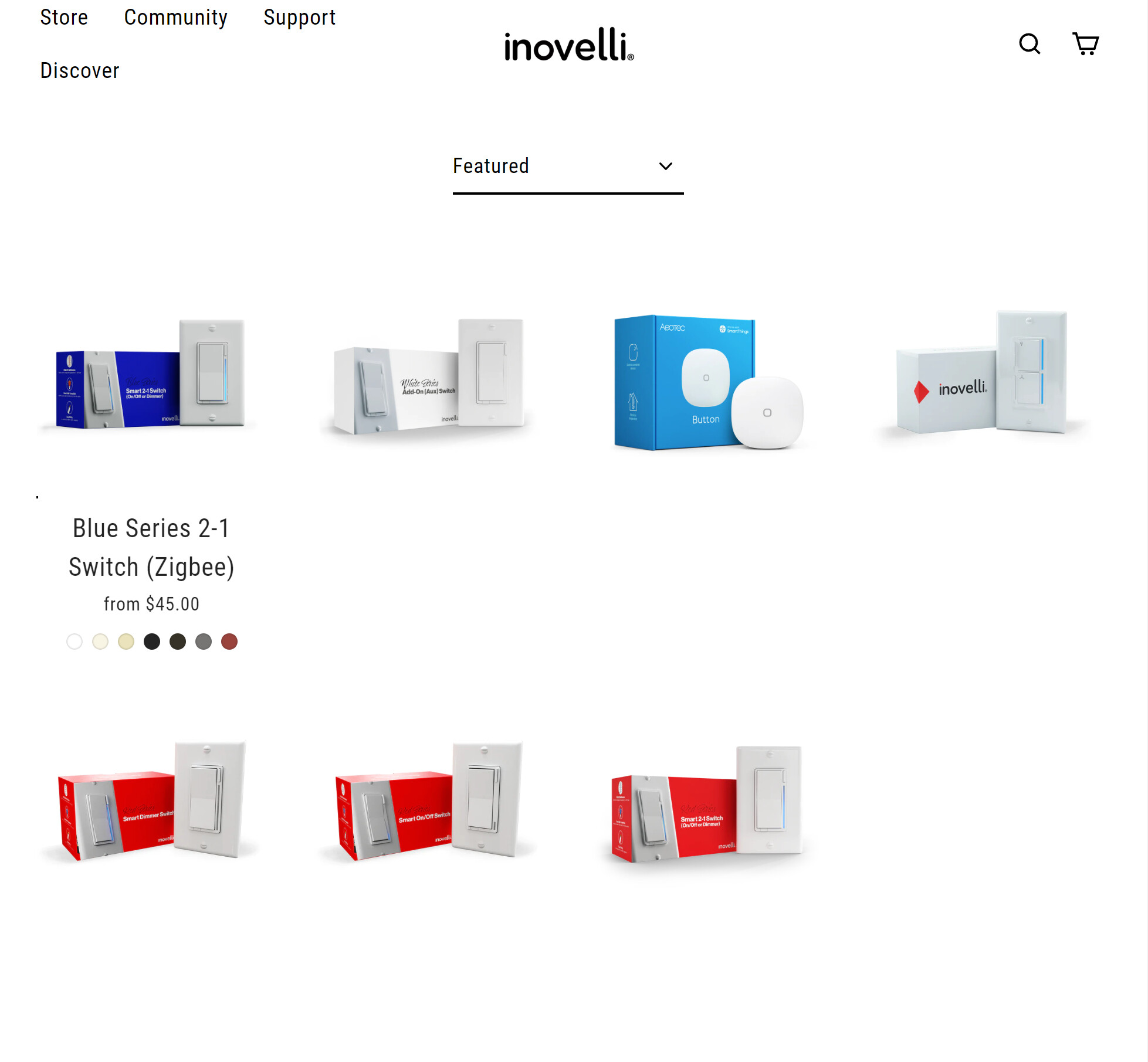
I believe this was mentioned earlier, but I would remove Blue/Red series from the store menu. These may make sense for returning buyers, but new buyers may be confused.
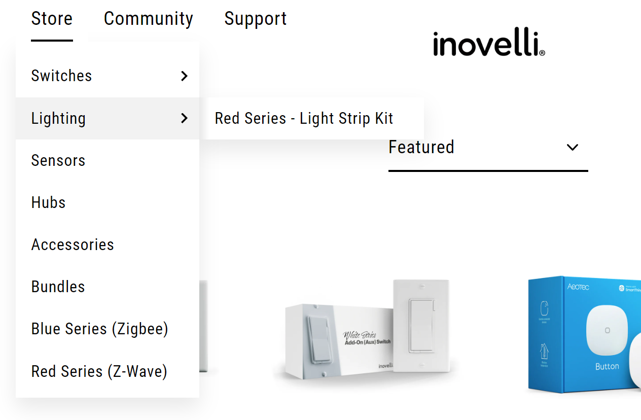
Under the switches flyout instead of listing the specific switches I could see creating groups for the types of switches. So, Store > Switches > Dimmer or Store > Switches > Combo (2n1). You could then use the landing page to explain the series options and why someone may want one switch over the other. I remember the lack of clarity around the Red/Black switches before their release, and wishing I had pre-ordered Red series.
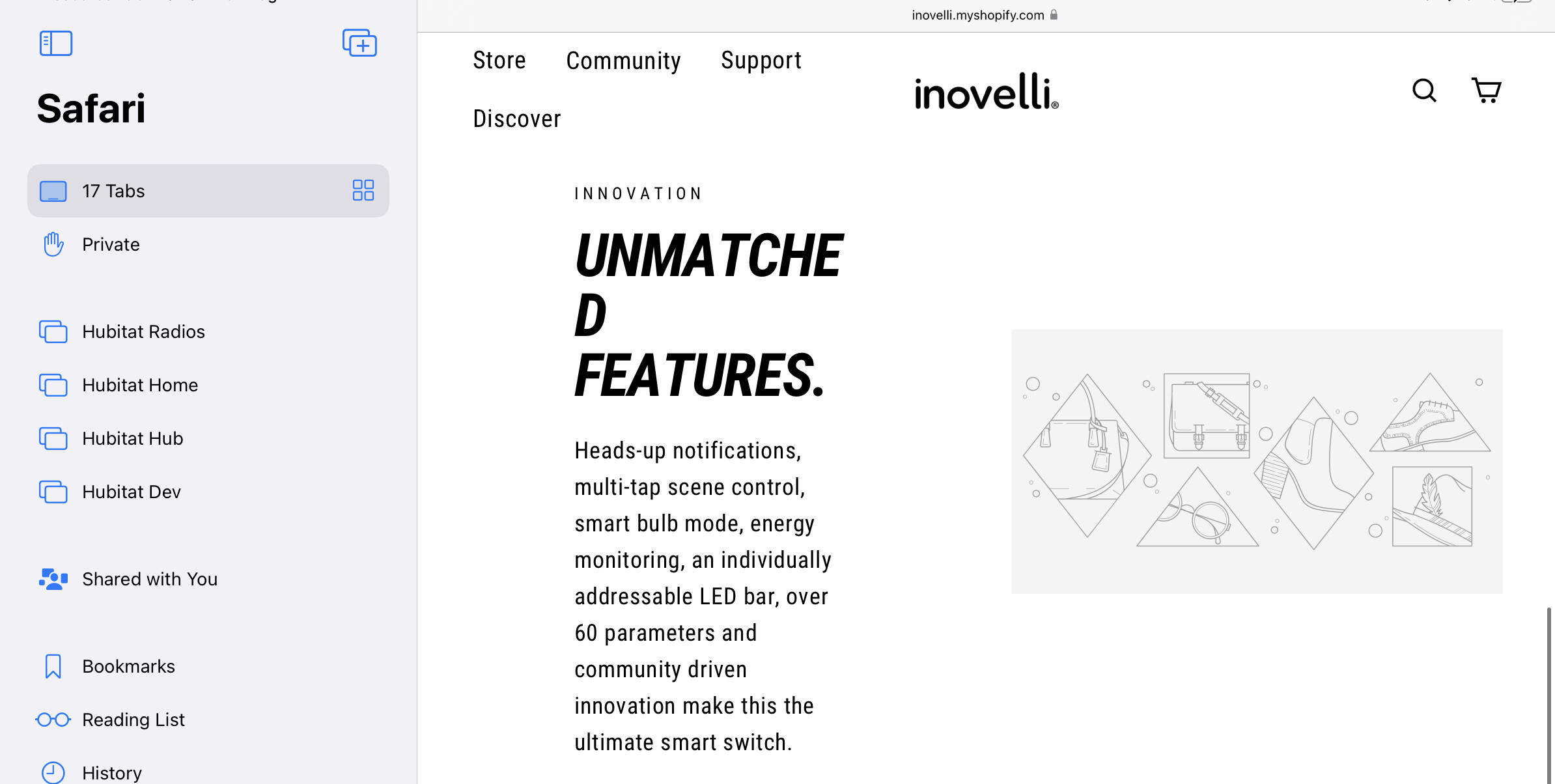
Home Page
It’s likely not as important these days, but one thing to keep in mind with all the animations (gif/video) is the overall page size. It’s currently around ~13MB, which is nothing on most wired connections. The impacts may be more noticeable on mobile.
“Animated Notifications” slider
I’m not sure who’s garage is featured, but it looks like they need to replace a light bulb  . I’ll mirror what others have said, you should consider adding arrows or some other more noticeable indicator. I completely missed that was a slider on my first pass.
I’ll slightly nitpick on the slides:
- Garage - It looks like you reuse the same animation in multiple spots. It’s more work, but I could see doing some different animation examples. For example, flashing red for garage open (better showcase the awesome animation potential).
- Scene Control - I would suggest slowing down the “video”. The transitions are fast enough I could see users missing what’s happening and/or having an adverse reaction to the rapid flashing. It’s also hard to notice the switch compared with Smart Bulb Mode.
Regarding the image quality. It should be possible to leverage javascript to replace the gif with a video if desired (only on desktop for example to keep page load down). That said, I think the gif quality is fine for this purpose. I would only look at these for a few second and then want to click for more information.
“Teaser Video” under Favorites. This seems out of place to me. I would have the actual video on the product page, but leave it off the home page. I would move the Crafted by Us section up to take it’s place.
“Shop Collections” block - As already noted the text gets a little lost on these. Reducing the transparency should resolve the problem.
Adjusting theme.css - line 9707, which will look something like this (with more lines in the brackets). You would just need to change the transparent part to adjust. (Granted shopify likely has you do this differently)
.skrim_title:before {
background: radial-gradient(rgba(0,0,0,var(--colorImageOverlayTextShadow)) 0%,transparent 80%);
}
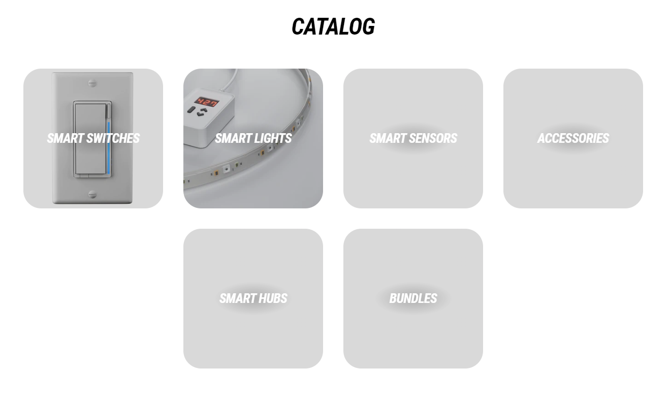
Catalog Page
This could be a good spot to add a block talking the different switch series.
Product Group pages
It looks like the newsletter block exists twice (“Sign up and save” and “Join the club”)
Hope this helps!