Is the pricing on this new site accurate? 10 packs are $400 on preorder but $450 after launch?
1 Like
This is NOT a new production site. It’s a site under development exposed for suggestions. I’d refer to Inovelli.com for pricing and ordering.
I understand that but wondering why they’d put different pricing on a site in progress, as the expectation is that they’re building this to go live eventually so if the pricing is going to be changing (either due to merger, supply chain cost increases, etc) then I’d like to know since I’ve already built my switch budget based on current pricing
I do plan on increasing the price, yes. Pre-order pricing is typically less than normal pricing as pre-orders are generally taking a risk.
I’m not entirely sure if $450 will be the final price and most of the pricing on the beta site is just me putting in random numbers (most of the products are actually $0.00).
I will make sure to let you guys know when the price increase goes into effect well before we actually do it to be conscious of budgeting.
My guess would be once production ends.
Oooo got to get that buy in before increase.
3 Likes
A couple general comments/observations and a recommendation.
FWIW, I’m a product manager with experience in B2B (or B2B2C) and B2C (DTC), specifically in ecommerce and marketplaces.
First general observation is that Inovelli has at least 3 different types of customers: novice/beginners, hobbyists and enthusiasts. Different customers have different needs (think “missions” or jobs to be done) and are willing to exert different levels of effort to satisfy those needs. For example, an enthusiast is willing to invest more time and energy to dig through the community to find niche content. A novice generally won’t. If you apply that to the type of feedback you’re going to get in this thread, it’s going to bias toward a particular type of customer (looking at you, 100mbps iOS 16 beta ![]() ).
).
Second general observation: similar to onboarding designs, if you need to explain the experience or justify the design, the design missed the mark. Look for patterns in feedback to identify problem areas.
IMHO, at the very least, develop 2-3 distinct personas, write a few big job stories for each (think of the user journey, eg research, buying, support) and then figure out your IA/content structure from there. If you can afford it, its hard to beat the impact of interviewing and observing customers interacting with the site.
1 Like
Yeah, I can do that – I looked at a few sites I’ve been getting inspiration from (Skullcandy, Mercedes, Bose, Beats by Dre, and Wyze) and it seems most have the consistency experience so this is a great call-out! Even if there aren’t sub-menus on some of the headers, it still makes you click the ones that do to expose the drop-downs giving you the same consistent expereince.
I specifically like the Wyze example:
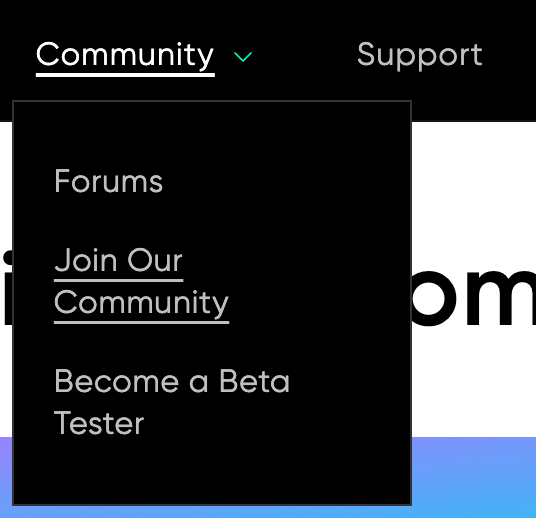
The, “Join Our Community” has links to their socials and Subreddit, which is smart.
Took me a while, but I figured out how to do it ![]() – should be good now – much better!
– should be good now – much better!
You should be able to click on the dots instead of dragging, but I changed it to arrows.
Nice, yeah I ended up fixing that later – good call!
Yeah that was annoying, thanks for noticing that – there was a setting that was on that enabled that. I disabled it so I think we’re good.
Yeah good call – I’ll have to do some digging on this one, but definitely something I want to fix.
Agree, appreciate you testing it on a smaller screen – I hadn’t noticed that (I even have a plug-in that allows me to quickly change layouts (mobile, tablet, laptop, desktop) but it didn’t have 1/2 of 1920 as an option.
I updated it so that the logo is completely to the left and the wording is to the right and there is no wrapping, so I think we’re good. Great catch!
Thanks ![]()
Hmmm… those are embedded videos. I’ll have to look to see why they’re taking so long to load.
Regarding the first video, yeah the purpose of the page was to tell the story around how we got started to where we are today. That was actually the first video we released back when we had our first iteration of products. We’ve come a long way!
Weird, what page is that on?
I’ll do some additional digging to see what others are doing (it looks like Hubitat and Wyze both have it, however, Home Assistant and SmartThings both have it at the bottom). My thought process was that if we’re relying on the community for help and want to make it a large part of our identity, it made sense to put it there front and center. But I can also see the argument for Discover or Support.
Yes, this would be my preferred method of tackling this too – the only problem is that the theme only allows for two sub-menus so I opted to put the Red/Blue at the bottom in case someone wanted easy access to everything.
But as you had the same sentiment as others, it seems like it could be confusing. Ultimately, it may come down to heat-mapping and analytics to see where people go and if it’s confusing. I definitely have it on my notes of things to look into and/or cut.
This is a great call-out – what size should we aim for?
LOL, this bothered me so much in the original video too… this was taken from the first video we had produced and it was a local couple who volunteered to have their house used. You’ll also notice in the video that they used a, “dumb” lock to mimic a smart lock smh lol.
I added the arrows, hopefully it makes it more prevalent now it’s a slider ![]()
Agree – about to hit-up Adobe Stock videos haha.
Yeah, agree here too. I’m actually really not happy with how that GIF turned out from both a speed and quality. I have to do some thinking on that one. I may just do a quick scene of lights turning off.
Nice, ok, I’ll take a look at javascript (or I should say I will have Maycock look at it bc I have no clue haha).
Yeah, I guess what I was going for was as you work your way down the page, you get more and more info about the, “Hero” (in this case the Blue Series) and that was the climax that tied it all together. But, yeah, it is a bit out of place – I changed it ![]()
Is there a way to do this with only the collection icons?
There’s a setting in my theme to add a transparency overlay, but the issue is that it overlays all my images and I don’t necessarily want that.
I love it – so smooth.
Let me take a look!
Ha, I wish. We are kicking off the project in the next couple weeks (just waiting on a PO) and depending on how many switches we can order will determine when they will be open for pre-orders. Until then, it will just be a big tease lol jk (I’ll likely remove it from the site as to not get ppl too excited).
2 Likes
Lol Can’t find it anymore… Like the latest changes! Menu works much better now for me on my iPad with the side bar open.
1 Like
Or even showing the other rooms as little boxes within the larger video frame so you can see “oh, when I hit this switch, this happened in other places in the house at the same time.”
1 Like
The site is down at the moment, getting a 502 Bad Gateway error.
Weird, what browser were you using? I’ve been working on it all day and haven’t noticed anything. That would be just my luck though (it going down).
I was using Brave (Chromium). It appears to be working now.
One note for feedback. On Android (Brave/Chromium) when you navigate to the Store / { category} / { product } and press the back button it takes you to the home page. I would have expected/preferred I stay on the category page I selected.
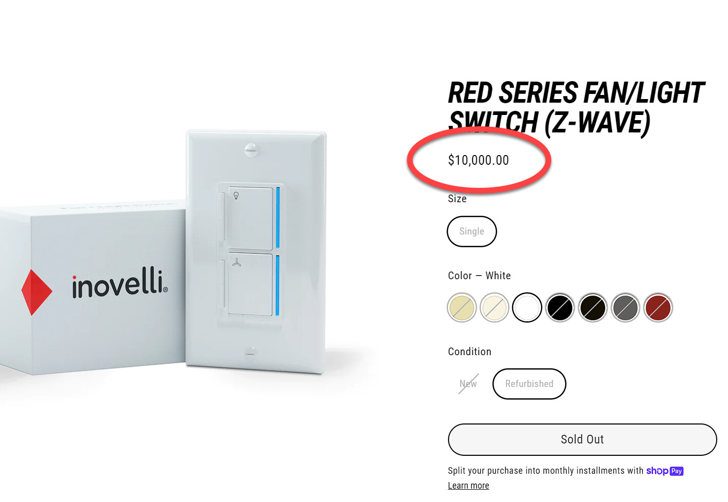
LOL, I had to bc people were ordering from the site and I can’t figure out a good way to pause the site w/out losing my ability to edit the pages. Figured the $10k would be a deterrent!
1 Like
Success!!! I laughed, then cried a little. ![]()
No testing vs production for the site? Dang…
I’d be willing to let a NIB LZW36 go for $9,000. A $1,000 savings. Free shipping.
3 Likes
There probably is, I just can’t find it ![]()
almost tempted. almost.
You can duplicate the theme and apply changes to it vs. the active theme, which lets you test. There’s also products like rewind which let you back up your entire store and restore it to another account for use as a staging site you can put behind a password. Some folks who run multiple stores go so far as to set up as a shopify partner so they can stage and deploy stores (but that’s a little extreme). Staging changes can be a pita, but the duplicate theme approach works for most lightweight changes.