Zigbee Button Controller + Dimmer Switch | Project Walt

This is how I feel lol.

Man, now I have to explain it in more detail? Dangit lol jk. Let me try my best to do so.

So here’s what we need to do at the very least for the B2B guys (who are funding this project):

  • Backlit buttons so that you can laser etch out words
  • Dual LED’s on each side that can change colors for notifications and to let you know the load is on/off, etc.
  • Virtually no light leakage
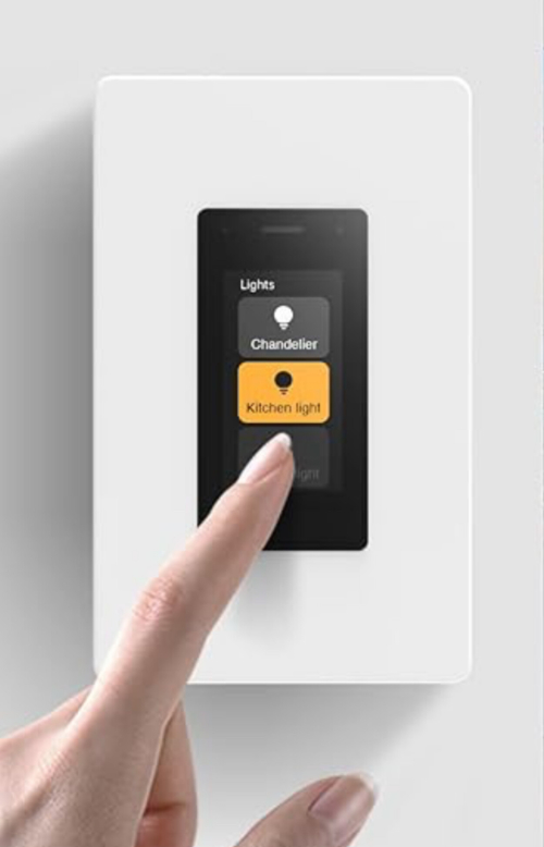
  • They want it to look similar to a competitor (can’t disclose it, but I’m sure everyone can figure it out – they’re big in the B2B/high end space, no one that we directly compete with)

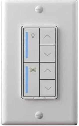
They don’t care about the mockup I showed as they don’t carry the Fan/Light Canopy and don’t have a need for the long LED’s. This is an Inovelli thing bc we want it.

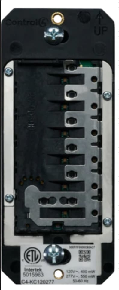
Knowing that we’re building off of our competitors switch, they have backlit buttons too as well as buttons that run down the right side of the switch.

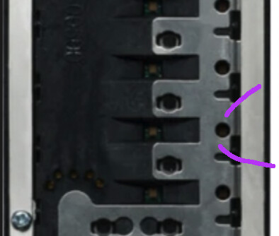
This is what theirs looks like under the paddle:

image

To achieve the backlit buttons, they have a row that runs down the middle. If you look, you can see how the light dissipates outward in sort of a, “fan” approach as shown by the red lines.

image

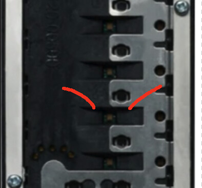
To achieve the LED’s on the right side, they have a metal piece that helps control the light so that it doesn’t leak into the center as shown by the purple lines.

image

To achieve the LED Bar, we’d have to do something like this:

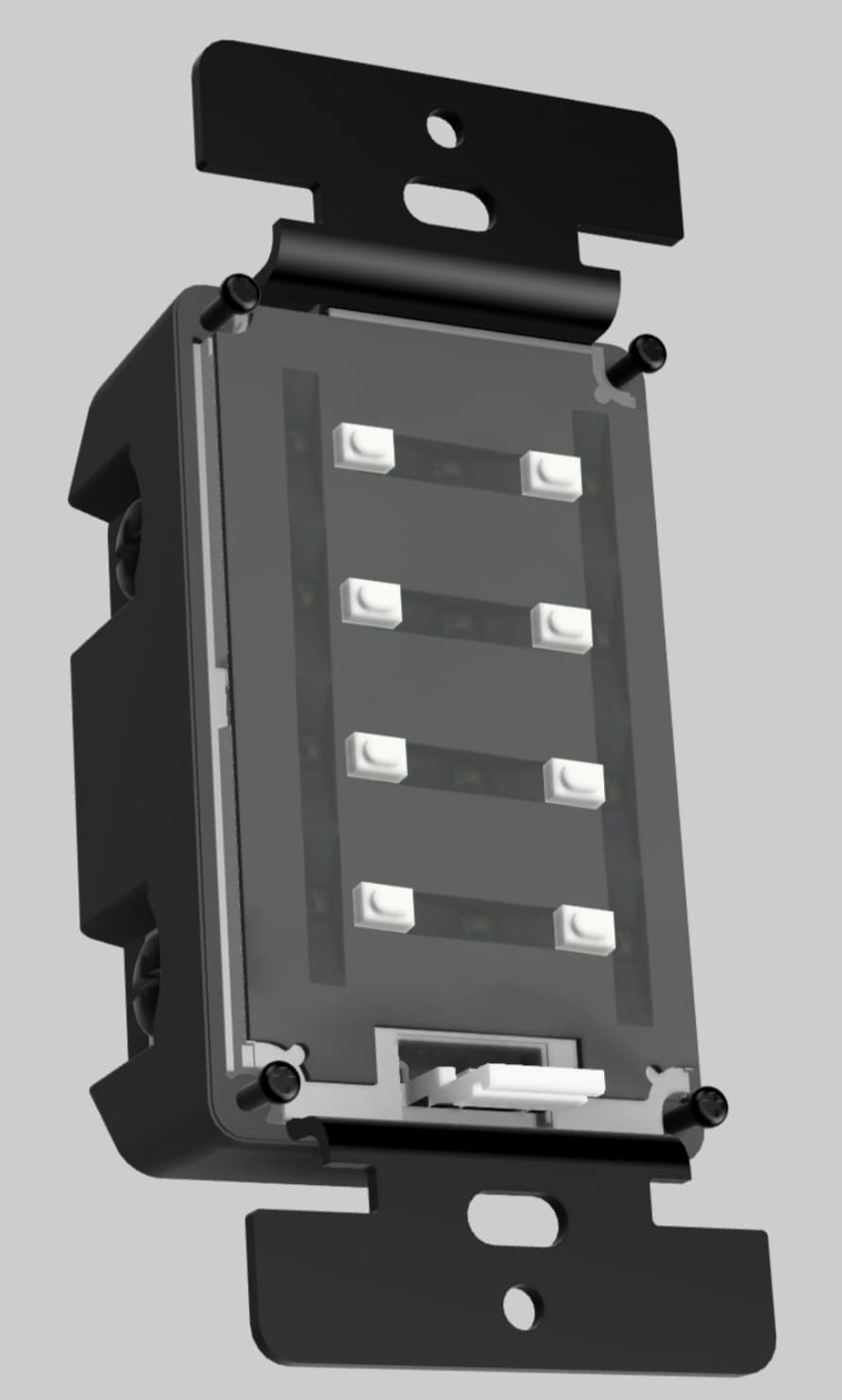
The LED’s on the side in the example above would do the same thing as the middle LED’s in that it would, “fan” out the light.

However, the challenge here then becomes light leakage into the other LED’s above/below. For example, this would work for this design:

image

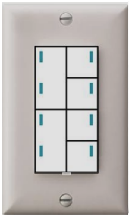
But not this design (which was one of the requirements of the B2B client):

image

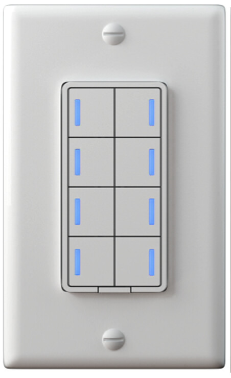
I proposed something like this (the white part would overlay the LED’s to help with light leakage) to initially solve for the LED Bar on the left:

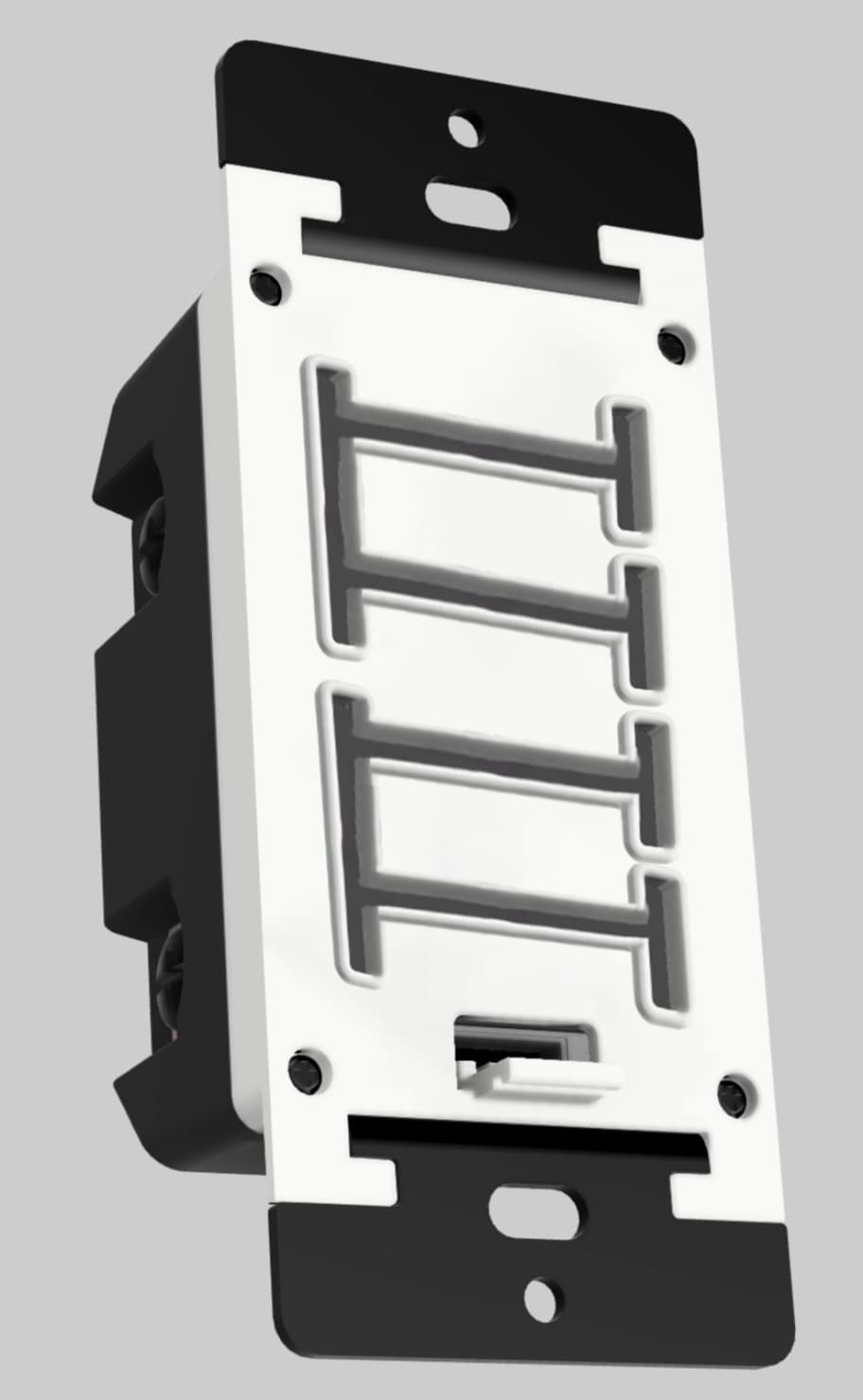
But the problem still exists with light leakage for this design:

image

We could build a special paddle that has some sort of blocking mechanism, but that’s where the increased tooling costs come into play.

Hope this all made sense. I’m still waking up and have paint fumes running around my brain from all my painting this weekend lol.

4 Likes

Agree with jsb,

While I don’t LOVE it, it’s still better than anything else out there, so I can’t really complain.

If this can manage the Fan Canopy, I would buy it.

1 Like

How many LEDs are in each of those proposed strip sections?

It appears to be 2 LED so the longer left strips really can’t show a dim level. So, why not do that design with an LED in each of the right buttons and no LED strip in the left buttons?

I’m not sure I understand the light leakage bit… Couldn’t the LEDs that are not under a transparent defuser be set to off?

3 Likes

How much of an issue is like leakage? Like is it 50% brightness leakage? If it’s a low percentage, how much of a problem would it be? I certainly prefer light leakage, but if it’s possible to get more fluid lights, that would be nice.

I agree with you on this, I was spoilt by your preferred choice, but the other one could work for me.

I too agree that I can work with that. The only suggestion/comment I have is to only have only LED bar/slot on the larger buttons since they would now need to be separated.

How about a thin cardboard insert with different light leak cutouts? I forget the name of it, but there’s a special type of cardboard product that is used inside electronics…

Fish Paper! That’s what it’s called!

1 Like

I have those Control4 switches and others. The obvious difference is that their switch only allows two keys at the bottom position. 7 total keys are possible, but you can have different sizes. Their older keypads had 6 fixed chicklets with lighting windows. The LED’s were bright enough that the whole button lit up even when they were not etched.

Having Control4 keypads I’m biased toward how nice they look. The single bars also permit hole words at a readable size… at the cost of space.

Perhaps you can do something with light pipes.

image

While I don’t love the 2 LEDs on the vertical buttons (atleast compared to the strip), I think it would be fine with just the top LEDs on the vertical buttons…or perhaps options for additional pieces so you can have the top LED or bottom LED visible and the other covered. Or both, but that’s a lot more pieces and materials to ship with every switch.

There should be 4 LED’s on each side and 4 in the middle (so a total of 12).

Yeah exactly, this is the predicament as well. We’d have to, “fake” the dim level anyway. But I’m not really sure that’s possible due to only being 2 LED’s.

Can you clarify this a bit? There should be an LED in each button.

I think the issue more was inconsistencies on the manufacturing line as it’s separate buttons being pieced together. I’m similar to you in that I don’t mind light leakage, but the B2B buyer is adamant in little to no leakage so we have to build it to their specs.

2 Likes

Just wanted to give an update in that they’ve finished the PCB design so the next step is working on the alpha sample.

Right now they are working on the first 3D print to be delivered in late April!

6 Likes

I was meaning a led in the right side up and down buttons on the fan/switch layout to indicate on-off instead of the big strip on the left. Or possibly 2 leds in each left button to indicate on-off. If the strip cant show the dim level then having a single one that long doesn’t really matter.

Personally, I think that looks terrible. It doesn’t match the look of the other devices in the lineup, and I would look to products from competitors if that is the final design.

2 Likes

How does this look different than the initial design? Other than there 2 lights on the left side?

1 Like

You answered your own question. IMO it doesn’t look elegant like the first design did. It looks cheap. It’s no longer a sliding bar that can be used as level indicator, which makes it significantly less useful.

The big one for me is it doesn’t seem to fit with the rest of the lineup. If it isn’t going to match the aesthetic of the Inovelli line, I might as well buy a competitors product that is cheaper, if it’s going to look cheap anyways.

Ok, you do you, but it’s a rendering, it’s not a picture.

1 Like

Honestly, I think multiple buttons and LEDs look dated. I’d rather have a better version of this. https://www.amazon.com/dp/B0B6PDKC64

Switch Display

Not to my taste. Constant power consumption and lack of tactile feedback (finding the right button without looking at it). And it’s clearly an entirely different product than what’s being developed here.

3 Likes