agreed, it’s a neat product, but costs twice as much and no tactile feedback.
As does every other smart switch.
It may look different, but it performs the same function. It can also provide features that buttons and LEDs cannot. (i.e. dynamic button labels, information screens, etc.) What good are buttons if they’re not labeled? Laser etching, sticky labels? No thanks.
It’s $49, which is less that this switch.
They also said that about the iPhone.
I’ll be honest, a design like this is the last thing I would expect from this company. There is no elegance the made the original black and red series stand out. I’d rather continue waiting for Inovelli to get it right than put this design up on my wall.
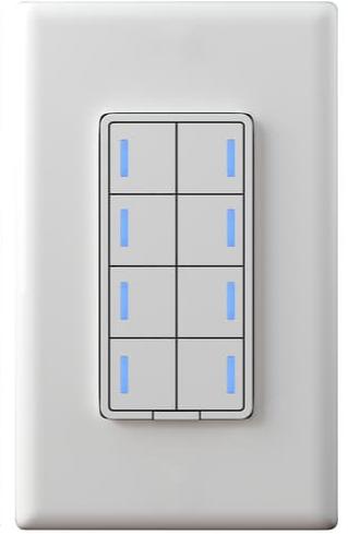
There would be 2 LEDs in the longer bar, so not very useful as level indication compared to the other switches with 7 LEDs.
I’m not sure when that design decision was made, but I think that is a mistake too.
When I think of what sets Inovelli apart and the reasons why I chose them over competitors, the signature feature is the LED bar. It’s a clean aesthetic that serves multiple purposes. You can get at a glance information about the switch’s state; it looks elegant and allows multiple notification options (many of them using the slider aesthetic.)
I think most of us thought we would see 8 LEDS down each side (2 per button) to allow that to happen.
When the image below was shared, many of us envisioned a switch that would give us the full functionality of the current Inovelli line (slider bar included) with multiple switch in one.
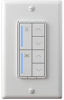
IMO, the product below is a COMPLETELY different product that no longer is capable of fulfilling the original promise of a single switch capable of completely replacing two or functioning as a fan switch and a light switch in a single gang, with all of the functionality of both, AND matching the aesthetic Inovelli is known for.
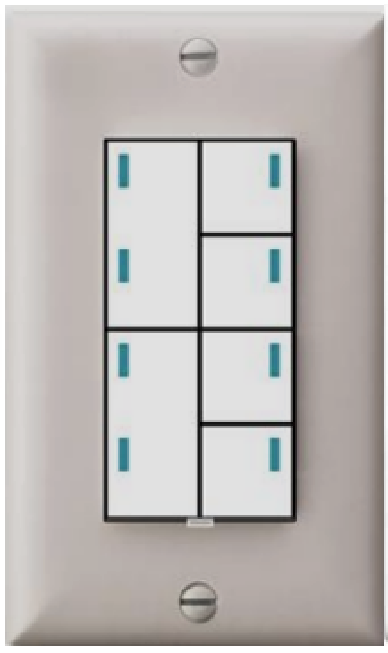
This is a completely different product, not a bad product. But, not what was originally shown and IMO doesn’t do a very good job of serving as a switch for a fan/light controller. It’s an 8-button scene controller. Nothing more, nothing less.
If that is a sacrifice that needs to be made, Inovelli should consider scrapping the vertical button options. Only offer the horizontal option (4 or 8-button), and then go back to the drawing board and find another option for a fan/light controller or dual light switch that is controlled the same and looks the same as the other light switches in the lineup.
I’m afraid there is a bit too much of an echo chamber in here that is just cheering on something—anything—being released and is all too willing to overlook serious design problems in the name of getting something out.
The all-in-one SKU to handle multiple configurations was a great idea if it delivered on all of its promises. At this point, it does not look like that is possible. If so many sacrifices are made that it no longer meets those original promises, it’s time to pivot and do one thing really well instead of several things just adequately. A jack-of-all-trades/master-of-none is not a good way to build brand enthusiasm and continue the success of the current products.
I 100% agree. I would probably not buy this as it looks nothing like other Inovelli products. I would probably go with a competitor’s product over that design. I admit that the light leakage problem may be too much to overcome, and B2B customers can be very picky, but so are Inovelli retail customers! I would recommend the customer go with this https://www.amazon.com/dp/B07WRT67T4/ instead of making Inovelli compromise on the design so much.
IMO if the 8-button design can be done with light bars down the whole side of each button (rather than just the top half), that would be a reasonable compromise and better match the Inovelli look.
We will have to wait a while yet to see if Inovelli can consider bringing back a standalone Fan/Light controller like the LZW36:
There is still definitely a market for it, Lutron sells these: Amazon.com and they’re great.
So, to summarize the above comments:

And perhaps even:

(sorry!)
I think many of us would buy the LZW36 if available. I know Inovelli had a problem with the vendor who made them but I feel like there is enough demand that a new version, from a new vendor would be successful. I would buy 2, maybe 3 right away.
Sadly your 2 or 3, plus my 5 (if I wasn’t moving to a house with no ceiling fans in a month) do not a bulk order make. ![]()
I get it, but 200/300 of us? Do a Kickstarter and see where it goes!
I would absolutely buy an LZW36-style switch/controller to go with the new Canopy modules.
This is the only reason I want the Walt controller anyway…
Add in my thumbs-down for the latest rendering as well… It doesn’t look like an Inovelli product.
Bring back Project Hurricane! Call it Project Typhoon, or Hurricane 2.0…
Hi @Eric_Inovelli, Would it be possible to have 8 (evenly spaced) LEDs down each side, then divide them into 4 groups of 2 using something like that mask you proposed (though it would be symmetric, 4 groups on both sides). If we choose to use a double height button somewhere, we could either accept a darker space between the 2nd & 3rd LEDs, or we could choose to cut out that piece of the mask.
The center LEDs would probably need to be lined up with the lower LED in each group, and only the lower LED would be used when using horizontal buttons.
Might even look OK with full height buttons. It could look (and function) like a dual version of all your other switches. (The paradigm shift with the LZW36 always bothered me slightly - from a rocker with on & off, hold to dim, to separate dim rocker & a toggle on/off button).
Separately, I don’t see a config button. Would it be possible to make the little button at the bottom “dual function” - pull it out for the air gap, push it in for config functionality?
Alright everyone – message heard loud and clear. Not pleased with the vertical design. Truth is, I am not either and I’ve tried to push the LED Bar design, but it’s simply not possible.
I’ve had to back up and think about what this product was actually meant to achieve and it was never really meant to be a light switch first, but rather a button controller. Yes, it has the ability to Dim, but that was a bonus that was added in case people preferred the flat front design instead of the current Decora paddle design.
Having discussions like this where everyone is involved is a double-edged sword. On one hand, it helps us create the best products we can and it’s the backbone of the company – on the other hand, we can get distracted from the original scope and try to fit every idea into the design and that’s exactly what has happened here.
For those that are saying this is not Inovelli’s best design and it doesn’t match the rest of our portfolio must have not been around 4 years ago when we first tried to launch this product as it’s the same exact design we had before, but now you have the ability to configure a few different options:
Design from 2020:
Project Link: Z-Wave 5-Button Scene Controller + Dimmer Switch | Project Limitless
Design from 2023:
I think we all got wrapped up in the concept @Xero came up with (me included – it’s a beautiful design). I also maybe failed to let you guys know this is a B2B project and they don’t care about the vertical design (in fact, their words were, “we have no need for that since we aren’t planning on using this as a light switch”) so I had to draw the line somewhere once we exhausted our options to achieve this design and I thought the alternate proposed was a decent proposal from the manufacturer. Again, not as pretty as what I’d hoped, but still solved for what we were trying to accomplish which was to have something be able to work with the Fan/Light Canopy Module and somewhat resemble the LZW36.
–
So, here’s what I’m going to propose:
Great idea @stephen.brown2! We will create a dual switch (we’ve been wanting to get this off the ground, but it was behind a few other projects in terms of prioritization) where you’ll be able to control two loads or use it as a remote to control the canopy module.
We can design it exactly like the mockup we all wanted (me included). We won’t be limited by the amount of LED’s on the side either as that was another roadblock to this design:
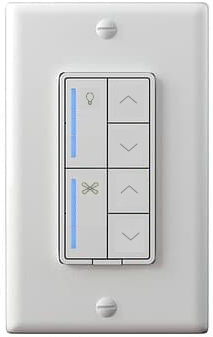
There were only two LED’s per bar, so it wouldn’t even give it the full effect we wanted. Now, if we create a dedicated switch, we could put 8 LED’s on the side (rather than the 4 that are in this button controller).
So, again, I appreciate the passion behind wanting the best product and because of this, I was able to run it by our COO and pitch the idea of moving the dual switch forward.
But as for this project, I believe we need to all remember what it started out as – a button controller, not the LZW36. Again, I know I thought we could do it and I wanted it to replace the LZW36, but we simply could not fit it into the current button design.
–
However, given we don’t have the capital to create this right now, we will have to go down the crowdfunding path to accelerate this.
Thanks again for all the back and forth, while it’s tough to read sometimes and I feel like everyone is taking direct pot-shots at me (I don’t think you are, but it’s how I feel sometimes bc these switches are my passion as well), I know you guys are doing it because you want the best, which is what we stand for.
Thoughts?
Where do I sign up to throw my money at you? ![]()
Honestly, I think that all the designs from 2023 are perfectly fine and usable as both a “light switch” and scene controller. The last two designs are what I was referencing when I said
Which would totally fulfill the “button controller” need this project is trying to achieve:
and we can continue waiting for a dedicated “dual (fan+light) switch”.
In summary, I am in favor of the “Designs from 2023”, but NOT the alternative suggested

The 8-Button design shown was a requirement from the B2B order, so I can’t do anything to modify it. As for the light bar down the side, we’ve asked them about this and they’ve said it’s not possible if we want to fulfill the other requirement of backlighting behind the paddles.
The other issue with the LED Bar look is that while it looks good, operationally it wouldn’t be that effective and wouldn’t match the current lineup where the LED Bar shows the % dim level. In other words, there are only 4 LED’s on each side. If we divide the switch in two, that’s only two LED’s per bar. We wouldn’t be able to show the correct fan speed and we definitely couldn’t show the correct dim level.
Does that make sense?
So you could do this, yes?
