Hey everyone – now that we’ve launched Inovelli 2.0 it’s time to optimize this bad boy and make it easier for everyone to find things.
Over the next couple of months, @Courtney_Inovelli, @anon14959390, @Brianna_Inovelli, @EricM_Inovelli and I are going to work on the overall user experience. There will be a lot that goes on behind the scenes from a logistics/inventory side that won’t really matter to you all, but it will help us be better at showing in-stock items for Canada vs USA. But more importantly, we want to make sure that when someone comes to the site, they can easily find what they want and fast.
This thread is for an open discussion on what you’d like to see improved with the site (be it bugs or enhancements).
In my opinion, there are three reasons why you go to a website:
- Learn
- Purchase
- Communicate
Learn
There are three places that will be (or are already) created where you can find information:
- Knowledgebase (support.inovelli.com)
- Community (community.inovelli.com)
- Smart Home 101 (to be created)
The KB & Community are typically for people that already know about us and are looking for help, whereas the Smart Home 101 section will be more of a spot where people who haven’t heard of us and are looking for a place to learn about what a smart home is and what can be done.
- KB = a place to go for Installation Instructions, How-To’s, drivers/handlers, manuals, etc.
- Community = a place to go for help, see what’s new, and connect with others
- SH 101 = will be a place to go that takes you across the entire journey of owning a smart home (beginner, intermediate, advanced) and it will be a place where we walk you through our lives a bit. More of a place for people to learn at any stage
Enhancements:
- Search to include both KB & Community threads (this has to be specialty coded bc it was two different platforms)
- Proper Tagging of articles and Community Threads
- Proper Organization of Community – I think I’ve done this by breaking up the community into sub-communities (ie: Hubitat, ST, HA etc) and a separate section for Wiring Discussions, but open to feedback for sure if it’s not working
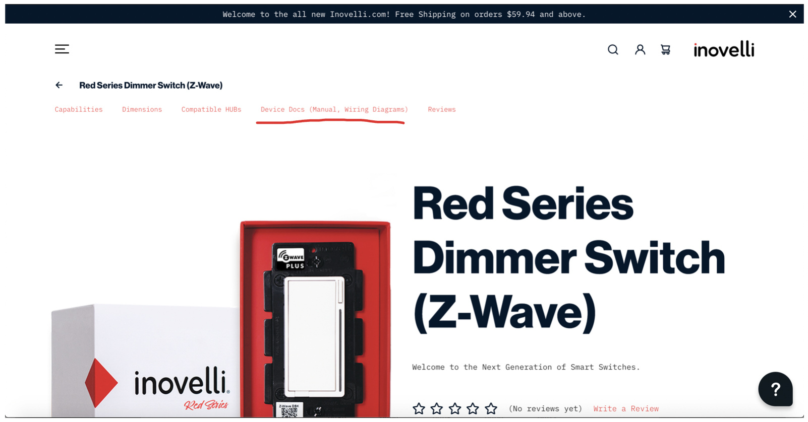
- Easy access to essential docs such as Manuals, Wiring Diagrams, etc
Purchase
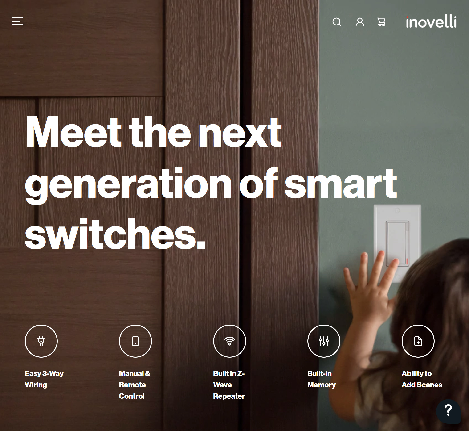
Not much to say here other than products should be easy to find and easily digestible. One of the issues we struggle with is that our products have a ton of features. How do we relay this message to people who are starting out?
Enhancements:
- Single Sign-On
- USA vs Canada Inventory (show out of stock if not in stock in one of the markets)
- Hub Compatibility Warning (purchase something that’s not fully compatible a warning will appear before you purchase)
Communicate
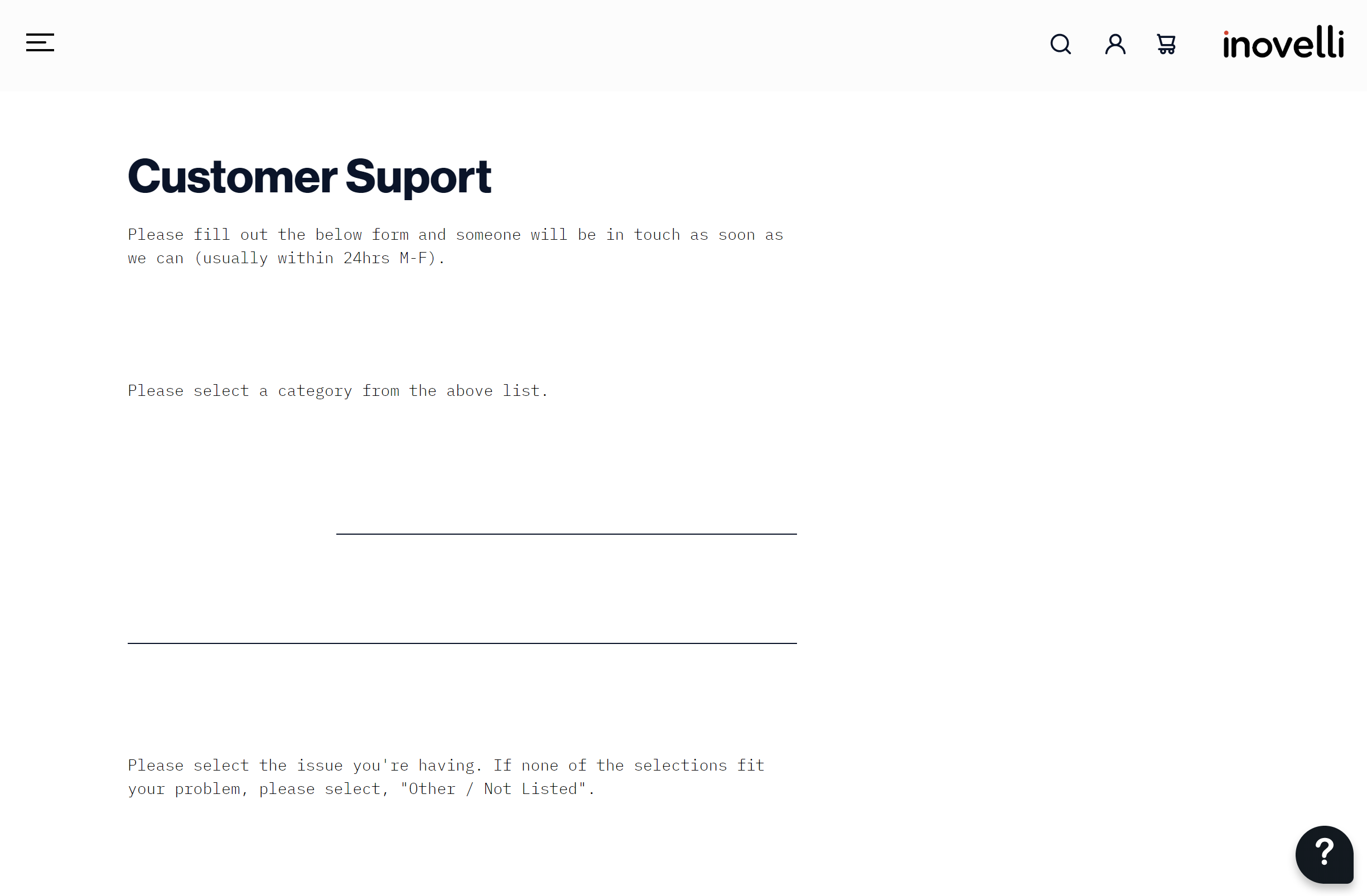
An easy way to reach us and communicate with either us or the community to get issues resolved.
We recently upgraded our helpdesk system that actually made things much easier to respond to tickets (now we just need more staff lol) and ultimately hopefully improved user experience as you can now log-in to see the status of your ticket(s), etc.
Enhancements:
- Single Sign-On
- Auto-emails that are hub specific that hopefully answer your question(s) or at least point you in the right direction
- Once there’s more staff, we can turn on Live-Chat which is built into our help-desk
Running list of optimizations/enhancements/bugs:
- Search in Forum and Site to include both KB & Community threads (this has to be specialty coded bc it was two different platforms)
- Forum Search
- Help Button Search (little blob at the bottom left of Inovelli.com) – In Progress
- Search bar at the top of the website
- Proper Tagging of articles and Community Threads
Proper Organization of Community– Done, but open to feedback- Easy access to essential docs such as Manuals, Wiring Diagrams, etc
Put link on top of product pages- Done- Easily searchable in search bars
- Single Sign-On across all three logins (KB, Inovelli, Forum)
- USA vs Canada Inventory (show out of stock if not in stock in one of the markets)
- Hub Compatibility Warning (purchase something that’s not fully compatible a warning will appear before you purchase)
- Auto-emails that are hub specific that hopefully answer your question(s) or at least point you in the right direction
- Once there’s more staff, we can turn on Live-Chat which is built into our help-desk
Looking forward to hearing from you guys and adding to our running list!
 I think it would be nice having a direct link to the newest device handlers in the front page of the support section, in my opinion.